November 7/8, 2020 – THERE IS PLANNING FOR EVERY SUBWAY SIGN


NOVEMBER 7-8, 2020
WEEKEND EDITION
203rd Edition
NYC Transit Authority
Graphics
Standards Manual

“Helvetica, once the hippest design choice in town, then ubiquitous, then tired, has come back into style.” Read the essay by Christopher Bonabos

In 1970 the subway system was a mess of mismatched signage, convoluted routings and was a obstacle course to find your train. A project was taken on by Bob Noorda, Massimo Vignelli and Unimark to re-imagine the look of our subway system graphics.
Images of the Original Standards Manual


Stand Clear.
by
Christopher Bonanos
The New York City subway, harsh and intrusive as it is, offers a paradoxical bubble of solitude to those who want it. Though the trains are noisy, and each contains a small town’s population at rush hour — nearly 2,000 people, a few of whom always have headphones blaring at loudspeaker levels — a commuter onboard can often recede, losing him- or herself in a form of privacy unique to a city of millions. The subway is (for the time being, anyway) mostly a place where cell phones don’t ring and e-mails don’t ping. If you’re not reading or playing a computer game as you wait, odds are you’re gazing into the middle distance, gaining strength from those few minutes when nobody is asking anything of you.
The middle distance, though, is not empty. A subway station is full of interesting things to look at. Mosaics. Bare-bulb light sockets next to, and superseded by, far more powerful fluorescence. Lively advertising, flanked by lousy advertising. Here and there, a cockroach or a rodent. And, of course, signs. Each of them contains relatively few words, sometimes just one or two, and they are not only placed in the middle distance; they are deliberately hung where you are supposed to see them. Bored eyes, accustomed to stimulation, tend to settle on even just a few letters.
The background of each is black, the letters white. The older signs are enamel on steel, with thickness and gloss to the porcelain; some newer ones are made with adhesive vinyl films in matte finishes. The train lines are indicated with discs in ten official colors. Important details, like exits and warnings, are on red and yellow backgrounds. A slim white band across the top of nearly every sign demarcates… something. (More about that later.) The typeface is Helvetica, that avatar of modern efficiency, except when it isn’t. (More about that too.) The graphics are markedly consistent, with just enough oddities to make the whole thing interesting, and they have become nearly as pervasive a symbol of New York City as yellow taxicabs and Art Deco skyscrapers are. By and large the system all makes sense, despite its failings. It took decades to make that consistency happen, and the 1970 New York City Transit Authority Graphics Standards Manual, reproduced in these pages, is where the whole project began.

In the mid-nineteen-sixties, the New York subway system was heading into the worst stretch in its history, and maybe the worst stretch that any big transit system will ever have. In fact, a lot of people were writing off New York City itself. For more than a century, it had been a manufacturing town, its big airy loft buildings cranking out machine parts, Oreos, paper boxes, printed matter, refined sugar, you name it. Millions of immigrants had arrived expressly to work in its factories.
In 1960, 95 percent of the clothing sold in America had come from the cutting tables and sergers of Manhattan’s garment district. Modern manufacturers, though, needed wide-open floors and truck-loading bays, not lofts on narrow streets with funky old elevators. By the sixties, the South and the West, offering clean new space and cheap labor, had begun to draw people away. Between 1969 and 1976, 600,000 jobs left New York. After a century in which the city’s population had increased nearly tenfold, it was losing people for the first time. A recession that began in 1968 cut into tax revenue, unemployment increased the demands on social-service programs, and the city’s solution was to borrow heavily every year. New York was going broke. On top of that, the subways were simply old, and looking older.
Since the 1920s, Robert Moses — the grand czar of urban planning, holding more consolidated power than the mayor or the governor — had pushed for more and more parkways, more and more buses, and not a dime more than was necessary for rail. His view had been the prevailing one of his generation. Cars were the versatile future; trains were the fixed-route past. In 1963, the wrecking ball hit Pennsylvania Station, a building that was worth less than the site on which it stood despite its irreplaceable grandeur. Public railways came with baggage of another kind — regular squabbles between labor and management — and in 1966 a strike shut the whole transit system down for almost two weeks. Never mind that the exhaust and traffic of car culture were beginning to bring problems of their own; never mind, too, that about 4 million people still rode the subway on an average workday. Moses held all the cards, and he dismissed those who, he sneered, “shout for rails and inveigh against rubber.”
Lack of money led to neglect. In these years, the prevailing practice of the NYCTA was called “deferred maintenance.” At any other time, taking care of the equipment — replacing track, greasing bearings, work like that — would have been done on a schedule, steadily. In a cash-poor environment, those processes were put off, over and over again. If a subway car should be painted every three years, and at the end of three years there’s a budget shortfall, you can delay the job a fourth year, and almost nobody will notice. At five years, it’ll become evident; at seven, the train will look seedy. But it’s not the immediate effect that’s the problem. In that time, a little rust may get going under the paint, or mechanical parts will wear past the point of no return, and you will have invisibly but palpably shortened that subway car’s life. Deferred maintenance meant borrowing against the future. In many cases, the maintenance was deferred indefinitely — that is, nothing was replaced until it actually broke, even if that meant it might happen in the middle of rush hour, backing up the lines for miles. The results were catastrophic.
Trains were grinding to a halt; signals and lights failed constantly; trash on the tracks caught fire; doors jammed. There were (notes the subway historian Marc Feinman) hundreds of stretches of bad track on which motormen had to stay under 10 miles per hour. Flat spots on worn steel wheels made the trains far louder than they should have been. On older cars, some of which were approaching 50 years’ service, the rattan seating was breaking down, snagging commuters’ clothes and stockings. Even when clean new trains arrived in the early seventies, they turned out to have reliability problems. Ridership was plunging — in 1976, it was half what it had been in 1949 — and the nearly deserted stations in turn provided new opportunities for crime. The whole system looked like hell, and perpetually seemed to be getting worse.

It had all been graceful, long ago. In 1904, when the first line was opened by the private Interborough Rapid Transit Company, neoclassical ornament dominated. The architects, a firm called Heins & LaFarge, specified ceilings with bands of wedding-cake detailing between the structural arches. Ticket booths were oak, with bronze grilles. The stations received unique faience plaques along the walls — American eagles by the armory at 33rd Street, the Santa María at Columbus Circle, and (most eccentrically, and charmingly) beavers at Astor Place, commemorating John Jacob Astor’s fur trade.
The station names themselves were rendered in mosaic tiles, with extraordinary delicacy of color and line. The stations built in the 1930s under another architect named Squire Vickers are more severe, but they too show the hand of an aesthete, and a machine-age strength that suits New York. The prevailing attitude is plain to see: The American century lies ahead, and this city is ready for it, with trains that run all night. As the urban fabric rippled out into Brooklyn and Queens and the Bronx, the train system that served it grew extremely complex.
Two more networks were constructed, augmenting and eventually competing with the IRT: the city-owned Independent Subway (or IND), and the private Brooklyn Rapid Transit System, later reorganized as the Brooklyn-Manhattan Transit Corporation (BMT). They quickly became essential. Yet, as World War I and then the Great Depression set in, all three struggled financially, owing to a city requirement that they keep the fare at a nickel. (There were no fare increases from 1904 to 1948, and it showed in the system’s shabbiness.)
In 1940, after the IRT went bankrupt, all three were merged under municipal control, creating an organization that eventually became the New York City Transit Authority. Because they’d been built separately, the stations were poorly knitted together, and navigating them was a kind of local craft, learned by feel and word of mouth. Yes, there were signs to tell you where to go, and yes, they helped a little. Most were white porcelain enamel on steel, though many of the large ones were forest green or cobalt blue. There was an artisanal beauty to them.
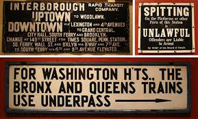
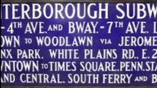
The typography — although you can’t really call it “type”; it was more a version of handdrawn lettering — often varied in size, with small words like AND or VIA subordinated in size. Ornate arrows curled to indicate stairways or unusual exits. Names were often abbreviated in entertainingly weird ways: BL’KER ST. for Bleecker Street, FORD’M RD. for Fordham Road. They were gorgeous, tactile objects. But as a way of getting you to your destination? This was the text you faced as you entered an IRT station (today’s 4 train) in Harlem or the southern
Bronx: I N T E R B O R O U G H RAPID TRANSIT CO.
UPTOWN TO WOODLAWN.
DOWNTOWN VIA LEX. AND 4th AV.
TO GRAND CENTRAL, CITY HALL, SOUTH FERRY AND BROOKLYN
CHANGE AT 149th ST. FOR TIMES SQ.
, PENN STATION, SOUTH FERRY, WALL STREET AND BROOKLYN VIA BROADWAY AND 7th AVENUE.
TO SO. FERRY VIA 6th AND 9th AVE. ELEVATED.
What? Why do I have to change for South Ferry when this train already goes to South Ferry? And do I change at 149th, or later on, to the 6th and 9th Avenue El? For god’s sake, I just want to get to Gimbels!

The essay continues on:
https://standardsmanual.com/products/nyctacompactedition

You can own your own copy of the Standards Manual. See above website.
WEEKEND PHOTO
SEND IN YOUR SUBMISSION
ROOSEVELTISLANDHISTORY@GMAIL.COM
WIN A TRINKET FROM THE KIOSK SHOP

FRIDAY PHOTO OF THE DAY
COLUMBUS CIRCLE STATION
Lots of correct guesses including
Hara Reiser, Vicki Feinmel, Andy Sparberg, Clara Bella

Funding Provided by: Roosevelt Island Operating Corporation Public Purpose Funds,
Council Member Ben Kallos City Council Discretionary Funds thru DYCD
1970 New York City
Transit Authority
Graphics Standards Manual
Designed by Massimo Vignelli
and Bob Noorda, Unimark, 1970 (c)
Edited by Deborah Dorff ALL PHOTOS COPYRIGHT RIHS. 2020 (C)
PHOTOS IN THIS ISSUE (C) JUDITH BERDY RIHS
EDITORIAL
Some subjects are addictive. The subway is one of them. There are so many wonderful stories to tell. We wrote about the decor and glory of Vickers designs the other day. In the 1960’s the hodge podge of merged lines and construction was deemed in need of replacement.
I remember when many station walls were covered over with bland decor in the 1970’s. Luckily the original tile work was not removed and many years later the “improvements” were removed and the original tiles with windmills, beavers and glorious lettering was restored.
Yes, the MTA does do good things!!!
When you are at Columbus Circle check out the sample tile work on the uptown #1 platform.
Judith Berdy


Copyright © 2020 Roosevelt Island Historical Society, All rights reserved.
Our mailing address is:
rooseveltislandhistory@gmail.com


Leave a comment