“Helvetica, once the hippest design choice in town, then ubiquitous, then tired, has come back into style.” Read the essay by Christopher Bonabos
In 1970 the subway system was a mess of mismatched signage, convoluted routings and was a obstacle course to find your train. A project was taken on by Bob Noorda, Massimo Vignelli and Unimark to re-imagine the look of our subway system graphics.
Images of the Original Standards Manual
Stand Clear. by Christopher Bonanos
The New York City subway, harsh and intrusive as it is, offers a paradoxical bubble of solitude to those who want it. Though the trains are noisy, and each contains a small town’s population at rush hour — nearly 2,000 people, a few of whom always have headphones blaring at loudspeaker levels — a commuter onboard can often recede, losing him- or herself in a form of privacy unique to a city of millions. The subway is (for the time being, anyway) mostly a place where cell phones don’t ring and e-mails don’t ping. If you’re not reading or playing a computer game as you wait, odds are you’re gazing into the middle distance, gaining strength from those few minutes when nobody is asking anything of you.
The middle distance, though, is not empty. A subway station is full of interesting things to look at. Mosaics. Bare-bulb light sockets next to, and superseded by, far more powerful fluorescence. Lively advertising, flanked by lousy advertising. Here and there, a cockroach or a rodent. And, of course, signs. Each of them contains relatively few words, sometimes just one or two, and they are not only placed in the middle distance; they are deliberately hung where you are supposed to see them. Bored eyes, accustomed to stimulation, tend to settle on even just a few letters.
The background of each is black, the letters white. The older signs are enamel on steel, with thickness and gloss to the porcelain; some newer ones are made with adhesive vinyl films in matte finishes. The train lines are indicated with discs in ten official colors. Important details, like exits and warnings, are on red and yellow backgrounds. A slim white band across the top of nearly every sign demarcates… something. (More about that later.) The typeface is Helvetica, that avatar of modern efficiency, except when it isn’t. (More about that too.) The graphics are markedly consistent, with just enough oddities to make the whole thing interesting, and they have become nearly as pervasive a symbol of New York City as yellow taxicabs and Art Deco skyscrapers are. By and large the system all makes sense, despite its failings. It took decades to make that consistency happen, and the 1970 New York City Transit Authority Graphics Standards Manual, reproduced in these pages, is where the whole project began.
In the mid-nineteen-sixties, the New York subway system was heading into the worst stretch in its history, and maybe the worst stretch that any big transit system will ever have. In fact, a lot of people were writing off New York City itself. For more than a century, it had been a manufacturing town, its big airy loft buildings cranking out machine parts, Oreos, paper boxes, printed matter, refined sugar, you name it. Millions of immigrants had arrived expressly to work in its factories.
In 1960, 95 percent of the clothing sold in America had come from the cutting tables and sergers of Manhattan’s garment district. Modern manufacturers, though, needed wide-open floors and truck-loading bays, not lofts on narrow streets with funky old elevators. By the sixties, the South and the West, offering clean new space and cheap labor, had begun to draw people away. Between 1969 and 1976, 600,000 jobs left New York. After a century in which the city’s population had increased nearly tenfold, it was losing people for the first time. A recession that began in 1968 cut into tax revenue, unemployment increased the demands on social-service programs, and the city’s solution was to borrow heavily every year. New York was going broke. On top of that, the subways were simply old, and looking older.
Since the 1920s, Robert Moses — the grand czar of urban planning, holding more consolidated power than the mayor or the governor — had pushed for more and more parkways, more and more buses, and not a dime more than was necessary for rail. His view had been the prevailing one of his generation. Cars were the versatile future; trains were the fixed-route past. In 1963, the wrecking ball hit Pennsylvania Station, a building that was worth less than the site on which it stood despite its irreplaceable grandeur. Public railways came with baggage of another kind — regular squabbles between labor and management — and in 1966 a strike shut the whole transit system down for almost two weeks. Never mind that the exhaust and traffic of car culture were beginning to bring problems of their own; never mind, too, that about 4 million people still rode the subway on an average workday. Moses held all the cards, and he dismissed those who, he sneered, “shout for rails and inveigh against rubber.”
Lack of money led to neglect. In these years, the prevailing practice of the NYCTA was called “deferred maintenance.” At any other time, taking care of the equipment — replacing track, greasing bearings, work like that — would have been done on a schedule, steadily. In a cash-poor environment, those processes were put off, over and over again. If a subway car should be painted every three years, and at the end of three years there’s a budget shortfall, you can delay the job a fourth year, and almost nobody will notice. At five years, it’ll become evident; at seven, the train will look seedy. But it’s not the immediate effect that’s the problem. In that time, a little rust may get going under the paint, or mechanical parts will wear past the point of no return, and you will have invisibly but palpably shortened that subway car’s life. Deferred maintenance meant borrowing against the future. In many cases, the maintenance was deferred indefinitely — that is, nothing was replaced until it actually broke, even if that meant it might happen in the middle of rush hour, backing up the lines for miles. The results were catastrophic.
Trains were grinding to a halt; signals and lights failed constantly; trash on the tracks caught fire; doors jammed. There were (notes the subway historian Marc Feinman) hundreds of stretches of bad track on which motormen had to stay under 10 miles per hour. Flat spots on worn steel wheels made the trains far louder than they should have been. On older cars, some of which were approaching 50 years’ service, the rattan seating was breaking down, snagging commuters’ clothes and stockings. Even when clean new trains arrived in the early seventies, they turned out to have reliability problems. Ridership was plunging — in 1976, it was half what it had been in 1949 — and the nearly deserted stations in turn provided new opportunities for crime. The whole system looked like hell, and perpetually seemed to be getting worse.
It had all been graceful, long ago. In 1904, when the first line was opened by the private Interborough Rapid Transit Company, neoclassical ornament dominated. The architects, a firm called Heins & LaFarge, specified ceilings with bands of wedding-cake detailing between the structural arches. Ticket booths were oak, with bronze grilles. The stations received unique faience plaques along the walls — American eagles by the armory at 33rd Street, the Santa María at Columbus Circle, and (most eccentrically, and charmingly) beavers at Astor Place, commemorating John Jacob Astor’s fur trade.
The station names themselves were rendered in mosaic tiles, with extraordinary delicacy of color and line. The stations built in the 1930s under another architect named Squire Vickers are more severe, but they too show the hand of an aesthete, and a machine-age strength that suits New York. The prevailing attitude is plain to see: The American century lies ahead, and this city is ready for it, with trains that run all night. As the urban fabric rippled out into Brooklyn and Queens and the Bronx, the train system that served it grew extremely complex.
Two more networks were constructed, augmenting and eventually competing with the IRT: the city-owned Independent Subway (or IND), and the private Brooklyn Rapid Transit System, later reorganized as the Brooklyn-Manhattan Transit Corporation (BMT). They quickly became essential. Yet, as World War I and then the Great Depression set in, all three struggled financially, owing to a city requirement that they keep the fare at a nickel. (There were no fare increases from 1904 to 1948, and it showed in the system’s shabbiness.)
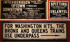
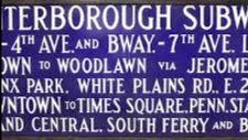
In 1940, after the IRT went bankrupt, all three were merged under municipal control, creating an organization that eventually became the New York City Transit Authority. Because they’d been built separately, the stations were poorly knitted together, and navigating them was a kind of local craft, learned by feel and word of mouth. Yes, there were signs to tell you where to go, and yes, they helped a little. Most were white porcelain enamel on steel, though many of the large ones were forest green or cobalt blue. There was an artisanal beauty to them.
The typography — although you can’t really call it “type”; it was more a version of handdrawn lettering — often varied in size, with small words like AND or VIA subordinated in size. Ornate arrows curled to indicate stairways or unusual exits. Names were often abbreviated in entertainingly weird ways: BL’KER ST. for Bleecker Street, FORD’M RD. for Fordham Road. They were gorgeous, tactile objects. But as a way of getting you to your destination? This was the text you faced as you entered an IRT station (today’s 4 train) in Harlem or the southern
Bronx: I N T E R B O R O U G H RAPID TRANSIT CO. UPTOWN TO WOODLAWN. DOWNTOWN VIA LEX. AND 4th AV. TO GRAND CENTRAL, CITY HALL, SOUTH FERRY AND BROOKLYN CHANGE AT 149th ST. FOR TIMES SQ. , PENN STATION, SOUTH FERRY, WALL STREET AND BROOKLYN VIA BROADWAY AND 7th AVENUE. TO SO. FERRY VIA 6th AND 9th AVE. ELEVATED.
What? Why do I have to change for South Ferry when this train already goes to South Ferry? And do I change at 149th, or later on, to the 6th and 9th Avenue El? For god’s sake, I just want to get to Gimbels!
The essay continues on: https://standardsmanual.com/products/nyctacompactedition
You can own your own copy of the Standards Manual. See above website.
COLUMBUS CIRCLE STATION Lots of correct guesses including Hara Reiser, Vicki Feinmel, Andy Sparberg, Clara Bella
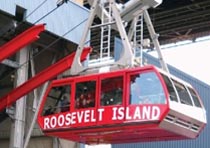
Funding Provided by: Roosevelt Island Operating Corporation Public Purpose Funds, Council Member Ben Kallos City Council Discretionary Funds thru DYCD
1970 New York City Transit Authority Graphics Standards Manual
Designed by Massimo Vignelli and Bob Noorda, Unimark, 1970 (c)
Edited by Deborah Dorff ALL PHOTOS COPYRIGHT RIHS. 2020 (C)
PHOTOS IN THIS ISSUE (C) JUDITH BERDY RIHS
EDITORIAL
Some subjects are addictive. The subway is one of them. There are so many wonderful stories to tell. We wrote about the decor and glory of Vickers designs the other day. In the 1960’s the hodge podge of merged lines and construction was deemed in need of replacement.
I remember when many station walls were covered over with bland decor in the 1970’s. Luckily the original tile work was not removed and many years later the “improvements” were removed and the original tiles with windmills, beavers and glorious lettering was restored.
Yes, the MTA does do good things!!!
When you are at Columbus Circle check out the sample tile work on the uptown #1 platform.
The story of Squire Vickers, the man behind the distinctive look of the New York City subway By KERI BLAKINGER NEW YORK DAILY NEWS | JUN 30, 2016 AT 8:15 AM
Squire Joseph Vickers (seen in his Class of 1900 Cornell yearbook) oversaw subway design for more than three decades. (Cornell University)
You’ve probably never heard of him, but an eccentric man from Rockland County is one of the people most responsible for the look and feel of the New York City subway system. Squire Vickers, the system’s chief architect for more than three decades, oversaw the design of more stations than any other individual — and he left his stamp on the system, with signature tile station plaques and a distinct Arts and Crafts design that permeates the system to this day.
To understand Vickers’ style, though, first it’s necessary to understand what came before him. When the first subway opened in 1904, it had been designed by ecclesiastical architects — church designers. Today, the subway might seem like the most unholy of places, but the system’s first architects — MIT grads George L. Heins and C. Grant LaFarge — were best known for winning the competition to design the Cathedral Church of St. John the Divine.
In 1901, according to the New York Times, they snagged the job as chief architects for the first subway line, which would run from City Hall up to 145th St. The City Hall station was the crown jewel of the Interborough Rapid Transit subway line, featuring elegant Tiffany skylights and ornate Gruby faience tiles.
Like the other 1904 stations, City Hall was influenced by the Beaux Arts movement, a Parisian neoclassical style of architecture.
“That was an aesthetic that architects at the time were embracing,” MTA Arts & Design Director Sandra Bloodworth told the News.
“They were also evoking the City Beautiful movement showcased at the Chicago World’s Fair, with the hope that if you created these great public spaces it would bring out the higher civic nature of the people.”
Heins and LaFarge stations are often identifiable by those plaques. If the plaques feature the depth of ornate bas relief, you’re probably in a 1904 station. Those early Heins and LaFarge stations are filled with swoops and swirls and architectural flourishes. Also, they’re only on the numbered lines — the lettered lines were built later.
Squire Vickers — who undoubtedly has the coolest name in New York transit history — was an eccentric painter who graduated from Cornell University, according to the New York Times. He lived north of the city— in a Rockland County town called Grand View-on-Hudson — in an Arts and Crafts-style home he designed. The interior of his artist’s retreat was decorated with tiles, much like an upstate subway outpost.
When he wasn’t masterminding the look of the then-biggest underground transit system in the world, Vickers passed the hours painting and writing Romantic poetry. Though he was not a New Yorker, he was a regular subway rider; his daily commute to Manhattan included jaunts on the train, ferry and subway. When he took over as the system’s chief architect, he brought his own sensibilities to the system.
When Vickers took over subway design, he went for an easier-to-maintain Arts and Crafts style that relied heavily on colorful tiled mosaics.
“He was an architect and then he became the primary architect for station design beginning in 1908 till the 1940s,” transit historian and “From a Nickel to a Token” author Andy Sparberg explained. “His stations encompass two types.” First, he oversaw the stations influenced by the Arts and Crafts style. They are less ornate — and easier to maintain — than their Beaux Arts predecessors. Gone were the three-dimensional bas reliefs and swirling flourishes, as curves gave way to straight lines and faiences to vividly colored mosaic tiles and geometric designs.
The Rector St. subway stop features Vickers’ work, as do many of the other stops south of Times Square. (Gryffindor/Wikimedia Commons)
Although some of Vickers’ affection for the simplicity of Arts and Crafts style was undoubtedly about aesthetics and ethos, some of it was probably about dollars and cents. “With Heins and LaFarge,” Transit Museum curator Carissa Amash told the Times in 2007, “there was a point at which it was like, ‘Hey guys, you’re going to have to rein in the costs,’ but with Vickers it was pretty much a tight budget from the get-go.” Some of the most striking examples of his work can be found on many of the local stops south of Times Square — Rector St., Franklin St., Houston St. The geometric mosaic bands along the walls of the Times Square complex, the City Hall mosaics at the R train’s City Hall stop and the train mosaics at Grand Central are all vivid examples of Vickers’ work.
Vickers oversaw the design of the 14 St.-Union Square subway station, which features this tile design. (Keri Blakinger/New York Daily News)
Over time, though, his style shifted. When the city decided to erect the Independent Subway System — better known as the IND — Vickers imbued the new stations with a noticeably different aesthetic. “When the city began building IND stations opening in 1932, they adapted Machine Age design, a variant of Art Deco,” Sparberg explained. Machine Age sensibilities were more streamlined and bolder, evoking a feeling of modernity and precision. As that influence took over, the station name tiles shifted to sans-serif fonts and solid colors. The old IND stations — which correspond to lettered lines after H — feature austere mosaic name tiles with sharp edges and bold colors. They’re vibrant and lively — but straight-to-the-point and all business.
The IND stations have a distinctly different tiling theme from the stations that came before them. (Youngking11/Wikimedia Commons) Although Vickers would have overseen the IND station design, Bloodworth cautioned that it’s not certain how hands-on he was in the bold tiling that defines the look of the IND platforms today. “I’ve always wondered who really did that because it’s so different from his sensibilities,” she said. Above all, his sensibilities focused on a fundamental belief that better art made for better people. “If we start out to find that which is best in art, it will permeate the entire life and rule of action,” he once wrote.
SPORTS FIELDS ON RANDALL’S ISLAND ANDY SPARBERG CLARA BELLA JOAN BROOKS WERE THE EARLY BIRDS
Text by Judith Berdy Thanks to Bobbie Slonevsky for her dedication to Blackwell’s Almanac and the RIHS Thanks to Deborah Dorff for maintaining our website Edited by Melanie Colter and Deborah Dorff Roosevelt Island Historical Society MATERIALS USED FROM:
The story of Squire Vickers, the man behind the distinctive look of the New York City subway
By KERI LAKINGER NEW YORK DAILY NEWS |(C) JUN 30, 2016 AT 8:15 AM
FUNDING PROVIDED BY ROOSEVELT ISLAND OPERATING CORPORATION PUBLIC PURPOSE GRANTS CITY COUNCIL REPRESENTATIVE BEN KALLOS DISCRETIONARY FUNDING THRU DYCD
TUGBOAT SAILING BY CENTRAL NURSES RESIDENCE WHERE 455 NOW STANDS. RITA MEED WAS THE WINNER!!
PHOTO OF THE YEAR
OUR GREAT POLL WORKERS AFTER A DAY WORKING AT PS217!!
MEMORIES
CLARIFICATION WE ARE HAPPY TO GIVE WINNERS OF OUR DAILY PHOTO IDENTIFICATION A TRINKET FROM THE VISITOR CENTER. ONLY THE PERSON IDENTIFYING THE PHOTO FIRST WILL GET A PRIZE. WE HAVE A SPECIAL GROUP OF ITEMS TO CHOOSE FROM. WE CANNOT GIVE AWAY ALL OUR ITEMS,. PLEASE UNDERSTAND THAT IN THESE DIFFICULT TIMES, WE MUST LIMIT GIVE-AWAYS. THANK YOU
Text by Judith Berdy Thanks to Bobbie Slonevsky for her dedication to Blackwell’s Almanac and the RIHS Thanks to Deborah Dorff for maintaining our website Edited by Melanie Colter and Deborah Dorff All image are copyrighted (c)
MICHEAL FRANK PHOTOS PART OF THE RIHS ARCHIVES
FUNDING PROVIDED BY ROOSEVELT ISLAND OPERATING CORPORATION PUBLIC PURPOSE GRANTS CITY COUNCIL REPRESENTATIVE BEN KALLOS DISCRETIONARY FUNDING THRU DYCD
Clyde J. Singer (1908-1999), East River, 1938, oil on canvas, 32 x 40 ¼ in.
Born in 1908, in Malvern, Ohio, forty miles south of Akron, Clyde Singer became known for his Social Realist and American Regionalist paintings and watercolors. His style and subjects were inspired by the Ash Can artists Robert Henri and John Sloan as well as the American Scene painters John Steuart Curry and Grant Wood. He studied at the Art Students League beginning in 1933, and his teachers included Curry and Thomas Hart Benton, among others.
The two artists that he admired most were George Bellows and John Sloan, and in non-classroom hours, he sought out locations where they had painted. Singer had the opportunity of meeting Sloan and developed a friendship with him, hearing stories about The Eight. Returning to Ohio, he became recognized as a talented up-and-comer in the realm of American Scene painting. From 1935 to 1940, Singer began selling paintings and became more recognized as he participated in over eighty-two exhibitions in fifty-six cities.
East River, 1938, has the appearance of an Ash Can subject, focusing upon urban life along the river on the Eastside of Manhattan. Here, a trio of young women, perhaps office workers, are in intense conversation, while two children, with their backs turned, watch a classic New York City tugboat creating a spew as well as workmen on the opposite shore. The shore opposite the promenade is a site on Welfare Island (now Roosevelt Island since 1973), a tract of land in the river between Manhattan and Queens, just north of the Queensboro, now Ed Koch, Bridge. In the painting, workmen are engaged before the several storied building, which would open the following year (1939) as the Goldwater Memorial Hospital, the Welfare Island Hospital for Chronic Diseases (thel building was razed in 2014).
Although back in Ohio in 1938, the artist was clearly enamored with New York and continued to paint scenes of the City, as he did throughout his life. The year of East River proved a laudatory one for Singer, as he won a prize at the National Academy of Design for Barn Dance (private collection).
WEDNESDAY PHOTO OF THE DAY
PART OF OUR WONDERFUL GROUP OF POLL WORKERS WHO HELPED OVER 1850 ISLANDERS CAST THEIR BALLOTS
A SPECIAL THANKS TO OUR GREAT GROUP OF YOUNG, ENERGETIC LINE MONITORS!!!
TUESDAY’S PHOTO OF THE DAY
ANDY SPARBER AND OTHERS THAT I WILL POST SOON.
EDITORIAL
AFTER 100 HOURS AT EARLY VOTING AND 16 HOURS TODAY, I AM GOING TO CELEBRATE OUT 200TH ISSUE LATER IN THE WEEK.
JUDITH BERDY
SUPPORT THE RIHS AND SHOP THE KIOSK
OPEN WEEKENDS 12 NOON TO 5 P.M. ORDER ON-LINE BY CHARGE CARD
CLARIFICATION WE ARE HAPPY TO GIVE WINNERS OF OUR DAILY PHOTO IDENTIFICATION A TRINKET FROM THE VISITOR CENTER. ONLY THE PERSON IDENTIFYING THE PHOTO FIRST WILL GET A PRIZE. WE HAVE A SPECIAL GROUP OF ITEMS TO CHOOSE FROM. WE CANNOT GIVE AWAY ALL OUR ITEMS,. PLEASE UNDERSTAND THAT IN THESE DIFFICULT TIMES, WE MUST LIMIT GIVE-AWAYS. THANK YOU
Text by Judith Berdy Thanks to Bobbie Slonevsky for her dedication to Blackwell’s Almanac and the RIHS Thanks to Deborah Dorff for maintaining our website Edited by Deborah Dorff All image are copyrighted (c) Roosevelt Island Historical Society unless otherwise indicated
Google Images (c)
ALL IMAGES ARE SUBJECT TO COPYRIGHT (C)
FUNDING PROVIDED BY ROOSEVELT ISLAND OPERATING CORPORATION PUBLIC PURPOSE GRANTS CITY COUNCIL REPRESENTATIVE BEN KALLOS DISCRETIONARY FUNDING THRU DYCD
November this year is a crucial moment for many New Yorkers, with the election at the forefront of everyone’s attention. However, the rest of the month is filled with exciting art events and installations. As many people retreat indoors and shield themselves from the early winter breeze, now is a great time to visit some of the newest public art installations throughout New York City without having to worry too much about being around other people. Remember to wear a mask and practice social distancing as you check out these art installations, from the empowering Medusa Sculpture sitting across from the city’s criminal courthouse where many abusers were tried to the Mother Cabrini Statue unveiled by Governor Andrew Cuomo in Battery Park City. You have to catch a glimpse of the “plastic bag store” before it closes this month as well as take a ride to Rockaway for Shantell Martin’s new mural. Here are the public art installations on display in New York City this November:
A seven-foot tall bronze sculpture of Medusa was unveiled in Collect Pond Park in October, across from the New York County Criminal Court in Lower Manhattan. A collaboration between Medusa With The Head Project (MWTH) and New York City Parks, Medusa With The Head of Perseus is meant to question Medusa’s portrayal and narrative in Greek mythology and reimagine an inverted narrative.
Garbati made the original Medusa sculpture in 2008. He posted photos of it on social media in 2018, at the height of Me Too movement and the year the Argentine Senate rejected a bill that would fully decriminalize abortion during the first 14 weeks of pregnancy. The photos went viral, and the sculpture became a symbol of resistance for women. Garbati seeks to change the traditional narrative of Medusa by portraying her in a somber moment of self-defense, holding the head of her slayer. According to the organizers of the sculpture, Medusa With The Head of Perseus has been deliberately sited across the street from the courthouse where “high profile abuse cases, including the recent Harvey Weinstein trial.”
Light of Freedom, an outdoor art project in which a torch is filled with a timeworn bell, a herald of freedom, and with the arms of mannequins, is meant to reflect the current turbulent political climate in the country during a time of global pandemic and mass protests. The torch, based on the Statue of Liberty’s hand holding a torch which was on view in the same park more than a century prior, symbolizes the light of democracy. The artist Abigail DeVille said that the project is inspired by the words of abolitionist Frederick Douglass. “In my research, I have found that the first Blacks to be brought to New York City were eleven Angolans in 1626. That makes people of African descent the second-oldest group of settlers in New Amsterdam, after the Dutch,” DeVille said on Madison Square Park’s website. “Unfortunately, history has erased the contributions and victories of this group. I want to make something that could honor their lives and question what it means to be a New Yorker, past, present, and future.”
Photograph by Ian Douglas
Starting in October, you can visit “The Plastic Bag Store” at 20 Times Square, a public art installation and immersive theater project that was delayed from March due to Covid-19. The Plastic Bag Store is a work by artist and director Robin Frohardt, produced by Pomegranate Arts and presented by Times Square Arts. It will be open free to the public through November 7, 2020 from Wednesdays to Sundays, with advance reservations. The store will have thousands of hand-sculpted “products” made from discarded, single-use plastics. You’ll find everything you can find in a grocery store, like meat, produce, cakes, toiletries, dry goods, and even sushi rolls. According to Times Square Arts, “With The Plastic Bag Store, Robin Frohardt employs humor and craft to examine our culture of consumption and convenience and the enduring effects of single-use plastics. Small groups will enter The Plastic Bag Store for a 60-minute immersive experience, featuring hidden sets and a captivating puppet film that explores how the overabundance of plastic waste we leave behind might be misinterpreted by future generations.”
Photo: Kevin P. Coughlin / Office of Governor Andrew M. Cuomo
A new statue designed and created by the sculptors Jill Burkee-Biagi and Giancarlo Biagi dedicated to Mother Cabrini was unveiled by Governor Andrew Cuomo in New York City’s Battery Park. Located just south of the South Cove on the Battery Park Esplanade, the statue is in honor of Saint Frances Xavier (Mother) Cabrini. Born in Sant’Angelo Lodigiano in modern-day Italy in 1850, Mother Cabrini was the first American citizen to be made a saint by the Roman Catholic Church. Governor Cuomo announced plans for the creation of a Mother Cabrini statue and memorial on Columbus Day 2019. The announcement came in the wake of controversy surrounding the She Built NYC initiative from Mayor de Blasio and his wife Chirlaine McCray. She Built NYC will add five new statues of women in New York City, including one of Shirley Chisholm, the first African-American woman to serve in Congress. The five women were selected in part through a public voting process, and although Mother Cabrini won the vote, she was not chosen to be honored. A spokesman for She Built NYC stated at the time that she had not been selected because tributes already existed.
Time Square Arts’ Midnight Moment series, the world’s largest, longest-running digital art exhibition that displays on Times Square nightly from 11:57pm to midnight, continues into November with its newest art installation: Table Manners by artist Zina Saro-Wiwa. The projection on the screen features individuals from the Niger Delta Region who consume their meals with their hands while gazing directly at the artists’s camera during the videos. These videos are staged as a celebration of community, tradition, and a collective act of memory. Saro-Wiwa’s work, according to Time Square Arts website, is candid and vulnerable yet undeniably confrontational, raising consciousness around the socioeconomic and political troubles the oil-producing Nigerian region faces.
“Table Manners appearing as the Midnight Moment is a special curatorial opportunity. It suggests the magic of the Midnight Feast which is the inspiration for my opening night performance,” Saro-Wiwa said in a press statement. “My hope is that people can come together — socially distanced of course — and commune with not only the people of Ogoniland and Port Harcourt in Nigeria who I have filmed, but also with each other. To look each other in the eye and just be.”
Looking for a great fall photo op? Head to Manhattan’s Seaport District along the East River. At the Heineken Riverdeck at Pier 17 passersby will find a giant arch made out of 500 gourds. Standing under the arch, you will be surrounded by pumpkins of all shapes, sizes, and colors. There are tiny yellow pumpkins, large orange ones, and white pumpkins, decorated with intertwining leaves and branches.
The arch is situated to give you an amazing view of the Brooklyn Bridge and at night, the arch lights up with an orange glow. You can take pictures at the pumpkin arch now until Thanksgiving.
No one guessed the unused prison barge that is docked across from Riker’s Island. ( A blue and white elephant that is costing the city millions a year)
CLARIFICATION WE ARE HAPPY TO GIVE THE FIRST WINNER OF OUR DAILY PHOTO IDENTIFICATION A TRINKET FROM THE VISITOR CENTER. ONLY THE PERSON IDENTIFYING THE PHOTO FIRST WILL GET A PRIZE. WE HAVE A SPECIAL GROUP OF ITEMS TO CHOOSE FROM. WE CANNOT GIVE AWAY ALL OUR ITEMS,. PLEASE UNDERSTAND THAT IN THESE DIFFICULT TIMES, WE MUST LIMIT GIVE-AWAYS. THANK YOU
EDITORIAL
Remember to bring your FASTPASS to the poll site to make your check in go faster. P.S. 217 IS open 6 a.m. to 9 p.m. for voting.
See you at the polls, JUDITH BERDY
Text by Judith Berdy Thanks to Bobbie Slonevsky for her dedication to Blackwell’s Almanac and the RIHS Thanks to Deborah Dorff for maintaining our website Edited by Melanie Colter and Deborah Dorff All image are copyrighted (c) Roosevelt Island Historical Society unless otherwise indicated
Betty Parsons, Sailboat, Rockport, 1943-1982, gouache and pencil on paper, Smithsonian American Art Museum, Gift of Sandra B.D. Waters, 1984.120
William Zorach, Sailboat, woodcut on paper, Smithsonian American Art Museum, Museum purchase, 1967.19.2
Frank McClure, Sailboat, ink, Smithsonian American Art Museum, Bequest of Frank McClure, 1979.98.341
Werner Drewes, Sailboats, 1931, woodcut, Smithsonian American Art Museum, Gift of the artist, 1969.3.12
Marjorie Raiguel, Sailboat Basin, ca. 1940, watercolor and pencil on paper mounted on paperboard, Smithsonian American Art Museum, Transfer from the General Services Administration, 1974.28.249
William H. Johnson, Sailboats on the Water, ca. 1932-1937, tempera on paper, Smithsonian American Art Museum, Gift of the Harmon Foundation, 1967.59.68
Maurice Prendergast, Inlet with Sailboat, Maine, ca. 1913-1915, watercolor and pencil on paper, Smithsonian American Art Museum, Gift of Robert Brady, 1981.171A
Allen E. Philbrick, Fishing Boats, n.d., etching, Smithsonian American Art Museum, Gift of Chicago Society of Etchers, 1935.13.249
Blanche Lazzell, The Seine Boat, 1927/printed 1933, color woodcut on paper, Smithsonian American Art Museum, Museum purchase, 1982.75
Donald MacDonald, Docking Ferry Boat, ca. 1938, stencil cut and lacquer airbrush, Smithsonian American Art Museum, Transfer from D.C. Public Library, 1967.72.224
William H. Johnson, Boats, ca. 1933-1935, tempera with pencil on paper, Smithsonian American Art Museum, Gift of the Harmon Foundation, 1967.59.803
MONDAY PHOTO OF THE DAY
SEND YOUR SUGGESTION TO ROOSEVLTISLANDHISTORY@GMAIL.COM WIN A SMALL TRINKET FROM THE RIHS VISITOR CENTER KIOSK. WE CAN ONLY ACKNOWLEDGE 3 WINNERS EVERY DAY. THANKS, EVERYONE WHO IS NOT MENTIONED. WE APPRECIATE YOUR INTEREST
WEEKEND IMAGE
HIGH BRIDGE WHICH IS NOW A PEDESTRIAN WALKWAY ANDY SPARBERG IS THE WINNER!
CLARIFICATION
WE ARE HAPPY TO GIVE WINNERS OF OUR DAILY PHOTO IDENTIFICATION A TRINKET FROM THE VISITOR CENTER. ONLY THE PERSON IDENTIFYING THE PHOTO FIRST WILL GET A PRIZE. WE HAVE A SPECIAL GROUP OF ITEMS TO CHOOSE FROM. WE CANNOT GIVE AWAY ALL OUR ITEMS,. PLEASE UNDERSTAND THAT IN THESE DIFFICULT TIMES, WE MUST LIMIT GIVE-AWAYS. THANK YOU
EDITORIAL
EARLY VOTING ENDED TODAY. OUR POLL SITE HAD THE MOST VOTERS OF ANY IN THE CITY, OVER 35,000. JUDY BERDY
Text by Judith Berdy Thanks to Bobbie Slonevsky for her dedication to Blackwell’s Almanac Thanks to Deborah Dorff for maintaining our website Edited by Melanie Colter and Deborah Dorff All materials in this publication are copyrighted (c)
SMITHSONIAN AMERICAN ART MUSEUM
JUDITH BERDY
MATERIAL COPYRIGHT WIKIPEDIA, GOOGLE RIHS ARCHIVES AND MAY NOT BE REPRODUCED WITHOUT PERMISSION (C) FUNDING BY ROOSEVELT ISLAND OPERATING CORPORATION PUBLIC PURPOSE FUNDING
DISCRETIONARY FUNDING BY COUNCIL MEMBER BEN KALLOS THRU NYC DYCD