That grand pile in Queens across the river. The big thing with four towering red and white stacks – the Ravenswood Generating Station, to be precise. “Peaker” will come a bit later: read on.
It’s big. Ravenswood was the world’s first million kilowatt power plant. It was one of the largest power generating stations in New York, with the capacity to supply 21% of all the electricity used in New York City.
Some (early) history
We learn from an article in the Brownstoner magazine that the plant sits on the former site of the Jacob Blackwell Mansion, built in 1744. Blackwell was a latecomer, of course — the Dutch were well established along this coast by the 1650s. Jacob was one of 12 children of Robert Blackwell (who, you recall, came to own our island when he married the daughter of its former owner, Robert Manning). Jacob Blackwell became the owner of a Ravenswood house – not yet “the Mansion” – in 1717. At that time, Ravenswood became a neighborhood of fine riverside estates – now “the Mansion”. Soon, however, the wealthy moved eastwards on Long Island. Their mansions were left behind and by the late 1870s many ended up as orphanages and asylums. As the LIRR moved in along Newtown Creek, hundreds of small factories sprang up in Ravenswood which prospered along the busy East River. Finally, during the 1930s and 40s, vast tracts of public housing (and Queensbridge Park) were erected and the recognizable shape of modern Ravenswood was formed.
The Ravenswood plant was initially designed to be a nuclear generator!
Richard Gentilviso writes in a June 20, 2012 article in The Gazette that about the same time – summer, fall 1962 – the Japanese decided to allow Tokyo Electric to build a nuclear plant in Fukushima and Con Ed was about to go online at Indian Point, Con Ed also applied to the Atomic Energy Commission to build a 1,000-megawatt nuclear generating station at the Ravenswood generating station. This would have been the world’s largest nuclear plant, with a capacity greater than all existing nuclear power plants in the U.S. at the time.
Local opposition quickly coalesced against the proposal and succeeded in stopping the threat of a nuclear power plant in the Ravenswood area’s back yard. Expert views were conflicted. In April 1963, Con Ed Chairman Harland C. Forbes told a Congressional committee any concerns were “rather silly” and that “one or two people have raised some question about the genetic effects of radiation and so forth”. But in testimony to the same Congressional committee, David E. Lillenthal, a former chairman of the Atomic Energy Commission, said, “I would not dream of living in the borough of Queens if there were a large atomic power plant in that region because there is an alternative—a conventional thermal power plant to which there are no risks.”
On Jan. 6, 1964, Con Ed withdrew its application for the nuclear power plant at Ravenswood.
But, writes Gentilviso, the nuclear story wasn’t over. Con Ed proposed another plan in 1968 to build a nuclear reactor not more than several hundred feet from the Ravenswood plants below an abandoned hospital site on Welfare Island (now Roosevelt Island). A nuclear plant on our island!!! They made a third proposal in 1970 for nuclear plants built on man-made islands located several miles off Coney Island in Brooklyn and Staten Island. Neither plan went far.
At the end of the day, said J. Samuel Walker, a historian of the U.S. Nuclear Regulatory Commission, “Ravenswood was kind of a test case…” After Ravenswood, he said, the commission “agreed on kind of an informal rule: They wouldn’t allow a [nuclear] plant any closer to the city than Indian Point.
The Great Blackout of 1965: “Big Allis”
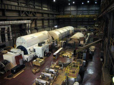
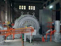
Con Ed’s first two Ravenswood units constructed in 1963 were Ravenswood 10 and 20, each having a generating capacity of approximately 385 megawatts. Then, in 1965, Cen Ed commissioned Ravenswood 30. It was built by Allis Chalmers which announced that Con Ed had ordered the “world’s first MILLION-KILOWATT unit…big enough to serve 3,000,000 people.” This sheer scale helped the plant become popularly known as “Big Allis”.
Big Allis played a role in the Great Blackout of 1965. The blackout – which affected many communities in the Northeast and Canada, began at a misprogrammed protective relay on a transmission line on the Beck power station in Queenston, Ontario, near Niagara Falls. The safety relay was set to trip if other protective equipment deeper within the Ontario Hydro system failed to operate properly. On a particularly cold November evening, power demands for heating, lighting, and cooking were pushing the electrical system to near its peak capacity. Transmission lines heading into southern Ontario were heavily loaded. The safety relay had been programmed incorrectly, and it did what it had been asked to do: disconnect under the excess loads it perceived. Bear in mind that at this time, all of these power generators scattered across the two countries were interconnected with few firewalls between them. The idea was that it would be easier to share power as required.
As a result of this failure, a small variation of power originating from the Robert Moses generating plant in Lewiston, New York caused the relay there to trip, disabling a main power line heading into Southern Ontario. Instantly, the power that was flowing on the tripped line transferred to the other lines, causing them to become overloaded. Their own protective relays, which are also designed to protect the lines from overload, tripped, isolating Beck station from all of southern Ontario.
With nowhere else to go, the excess power from Beck then flowed east, over the interconnected lines into New York State, overloading them as well. The Beck generators, with no outlet for their power, were automatically shut down to prevent damage. The story goes on, but basically a ”tsunami of power” was heading south. In New York City, as monitoring dials went wild, a crucial operator at the main power control station made frantic phone calls upstate instead of preemptively shutting down the city’s system to protect it. Automatic shutoffs took over and suddenly closed down the Con Ed system for the first time in its history, causing damage to the power system.
I was told (which means that I cannot confirm this) that people at Ravenswood hoped the Big Allis would withstand the oncoming load and keep the City’s power on. Alas, it was not to be. Big Allis’ burned up its bearings – because the device that kept the bearings oiled ran on the power generated by Big Allis – so Big Allis went down too.
Ultimately the 1965 power failure covered 80,000 square miles and affected about 25 million people. (But the Blackout Baby Boom turns out to have all been a myth.)
Who Owns Ravenswood?
Ravenswood was originally built and owned by Con Ed. Due to New York State’s energy market deregulation, Con Edison was required to sell all of its “in-city ” generating stations in New York City including Ravenswood. In 1999, Con Edison transferred ownership of Ravenswood to KeySpan Energy. In 2004, KeySpan constructed a new unit, Ravenswood 40, using combined cycle technology with generating capacity of 250 megawatts. National Grid plc acquired KeySpan in 2007 but due to its involvement in electrical transmission, the New York Public Service Commission required National Grid to sell Ravenswood to ensure competition in the market. On August 26, 2008, Ravenswood was sold by National Grid to TransCanada Corporation for $2.9 billion. Trans Canada sold Ravenswood to LS Power/Helix Energy Solutions Group with Ethos power running it. In 2018, Helix Generation LLC filed a lawsuit against TransCanada Facility USA Inc. for allegedly fraudulently misleading Helix prior to the sale.
And today – Peaker Plants
Ravenswood is not now of 16 operating Peaker plants in New York City that fit into the New York Power Authority’s market and send their energy to the city’s power grid. Peakers are run to provide power to the grid to meet peak demand. They were intended to be used only once or twice a year, but they now run in New York City on a more regular basis to meet the city’s growing energy demands, particularly in the evening when more lights and devices are turned on.
Peakers may be run only a relatively few hours in the year, but they often tend to be among the most polluting assets on the electrical grid. Reasons are they are older and they are fed by the most polluting fuel oil. Clean energy groups contend that the reductions in greenhouse gases are tremendous, when Peaker plants are replaced with renewables-plus-storage.
Peaker plants are also expensive. A new report (“Dirty Energy, Big Money,” published by the PEAK Coalition, which consists of New York City environmental justice groups NYC-EJA, UPROSE, and The Point CDC, as well as New York Lawyers for the Public Interest and Clean Energy Group) found that New Yorkers over the last decade have paid more than $4.5 billion in electricity bills to the private owners of the city’s Peaker plants, just to keep those plants online in case they’re needed—even though they only operate between 90 and 500 hours a year. Even at the upper limit, that’s less than three weeks. This all means that the price tag for peak electricity in the Big Apple is 1,300 percent higher than the average cost of electricity in the state. The report also found that about 85 % of the last decade’s peak electricity payments were funneled to three private, out-of-state firms—a Boston hedge fund, a Houston fossil-fuel generation company, and a New Jersey private equity firm—that own a large share of the oldest New York City Peaker plants.
In July 2019, the New York State Energy Research & Development Authority study identified Peaker plants in the state that could be replaced with battery storage, and Ravenswood was identified as a candidate to have an 8-hour battery storage facility that can power 250,000 homes. The report concluded that most of the Ravenswood transition could be completed by March 2021, and this transformation would be a new sustainable model for the city to transition other Peaker plants to zero emissions.
The Ravenswood plant would be the largest battery-run plant in the state, considered the first of its kind in the region, and would fall in line with Governor Cuomo’s Green New Deal goals of 1,500 MW of storage in New York by 2025 and 3,000 MW of storage by 2030. The state recently finalized new pollution restrictions that would drive the most polluting plants into retirement. Still, batteries are only as environmentally friendly as the sources of the power that recharge them. The Ravenswood battery would continue to be charged in part by existing fossil fuel infrastructure.
In this past October, the New York Power Authority (NYPA) said that it had agreed with a coalition of clean energy and environmental justice groups to assess how NYPA can “transition” the Peaker plants in its service area to “utilize clean energy technologies”. According to the NYPA and PEAK Coalition, the available options could include “battery storage and low to zero carbon emission resources and technologies”. As well as lowering greenhouse gas emissions and other pollutants, the transition plan is aimed at improving air quality. The NYPA-PEAK Coalition release emphasized that plans to transition NYPA’s six Peaker plants in New York City and one on Long Island, which have been in operation since 2001, must maintain the electric system’s reliability and resiliency requirements while helping the state meet its policy goal of achieving zero carbon electricity statewide by 2040.
Under New York’s groundbreaking climate law passed last year, the Climate Leadership and Community Protection Act, the state must reform this system to achieve a carbon-free electricity generation system by 2040. But many argue that there is no need to wait that long – the technology exists to transform the system – and that what is needed now is a commitment to prioritize the health and resilience of our hardest-hit neighborhoods.
QUEENSBORO BRIDGE FROM MANHATTAN WITH ELEVATOR STOREHOUSE BUILDING BY BERENICE ABBOTT No one guessed this one
FROM A READER
Hi Judy, I just saw the newsletter about Wodemar, and scrolling down I got a surprise–I have two of Woldemar’s prints, in your newsletter (versions of the two, I should say). I bought them more than 50 years ago, when I lived a few blocks from Gracie Mansion (in an old tenement walkup) and could barely afford art. They are quite large, and their colors are slightly different from the ones you show. Both are winter scenes, and show at least part of Roosevelt Island. They were something of a premonition of my future, at a time when I never imagined I would marry or move out of Manhattan. My dream then was to live in one of those East Side buildings that look out on these scenes.
I never knew anything about Woldemar Neufeld, so I thank you for the information. I don’t know why I never looked him up–the prints, which have the look of original woodcuts or linoleum prints–have been with me for so long, and I did buy them before there was internet or google. I have had them in my summer place in Maine for many years, because I like to have Roosevelt Island to look at while I’m away from here. I hope they’re ok–I haven’t been back to Maine this year and it’s unlikely that I’ll see my prints until next summer if we’re all lucky.
Susan Lees
Text by Judith Berdy Thanks to Bobbie Slonevsky for her dedication to Blackwell’s Almanac and the RIHS Thanks to Deborah Dorff for maintaining our website Edited by Melanie Colter and Deborah Dorff All image are copyrighted (c)
The Miriam and Ira D. Wallach Division of Art, Prints and Photographs: Photography Collection, The New York Public Library. “Queensboro Bridge: I. From 63rd Street Pier, Manhattan.” The New York Public Library Digital Collections. 1937. https://digitalcollections.nypl.org/items/510d47d9-4f4c-a3d9-e040-e00a18064a99
FUNDING PROVIDED BY ROOSEVELT ISLAND OPERATING CORPORATION PUBLIC PURPOSE GRANTS CITY COUNCIL REPRESENTATIVE BEN KALLOS DISCRETIONARY FUNDING THRU DYCD
TODAY IS VETERANS DAY, WHEN WE HONOR THOSE WHO SERVED AND DIED FOR OUR COUNTRY
Wednesday, November 11, 2020
OUR 207th ISSUE
OF
FROM THE ARCHIVES
WOLDEMAR NEUFELD
View, New York City, Upper East Side, Woldemar Neufeld, Hell Gate in Summer, George Glazer Gallery
Neufeld, Woldemar, Artist
Artist description:” This is where I wheeled my children uncountable times in buggies and strollers. It was really good and satisfying on these outings with my children because I could observe the tug boats from close up. Note the East River bridges against the background.”
Woldemar Neufeld (1909 – 2002) Born of German-speaking Mennonites in Waldheim, Russia, Woldemar Neufeld immigrated to Canada in 1924, arriving with hope that the “new world” would welcome him with opportunity. At age 15 Neufeld settled in Waterloo, Ontario. Eager to erase his immigrant identity, Neufeld plunged into the Canadian way of life by rapidly learning the Pennsylvania-German dialect that was spoken by many inhabitants locally, and by learning English at school.
Neufeld’s parents were insistent that their son receive serious training in religion and German, as he would have received at a Mennonite school in Russia. Enrollment at Waterloo College (now Wilfrid Laurier University) meant a strict education given by Lutheran Seminarians – Neufeld relished the degree of seriousness with which art was taught. A visit to Homer Watson’s studio in the village of Doon, a few miles from Waterloo, proved to have a significant influence on Neufeld’s future career. Watson, then a well-known Canadian painter, insisted that, should he ever pursue formal studies, Neufeld should remain true to his own vision and style.
Upon graduation from the college school in 1930, Neufeld enjoyed a career as an independent artist, living and working in Waterloo, Toronto and Vancouver. He helped found the Art Society of Kitchener, an artist collective that still exists today. He began taking ambitious sketching trips to northern Ontario, and short visits to see his sister in the United States. During one of these visits, Neufeld decided to enroll at the Art Institute in Cleveland, Ohio, and so came to spend the rest of his career in the U.S.A.
After spending a decade chronicling the area surrounding Cleveland in his paintings, Neufeld moved to New York City in 1945. Settling into a studio on the Upper East Side, Neufeld established himself as an artist and instructor along the city’s East River. The bridges, boats and shorelines became prominent as his subjects for oils, watercolours and block prints. He devoted himself to documenting the area, working with children in settlement houses and serving as an art director.
In 1949, the artist moved to an eight-acre farm among the hills, lakes and forests of Connecticut, just 80 miles north of New York City. Here, at New Milford – with Homer Watson’s ambitious studio as his inspiration – Neufeld turned his 140-year-old stone house and barn into a home, gallery and summer art school.
New Milford proved to be a further inspiration for the maturing artist. He discovered a passion for the surrounding landscape and subject matter and he chronicled the area in numerous paintings. Delighted with the similarities between this newest home and Waterloo, his first home in North America, Woldemar Neufeld chose to settle in New Milford, the last stop on his artistic journey.
Woldemar Neufeld died on November 24 from complications of Parkinson’s disease, shortly after his 93rd birthday.
JOAN BROOKS, VICKI FEINMEL AND LAURA HUSSEY GUESSED RIGHT BEFORE 7 A.M. CARLA BELLA WAS CORRECT TOO
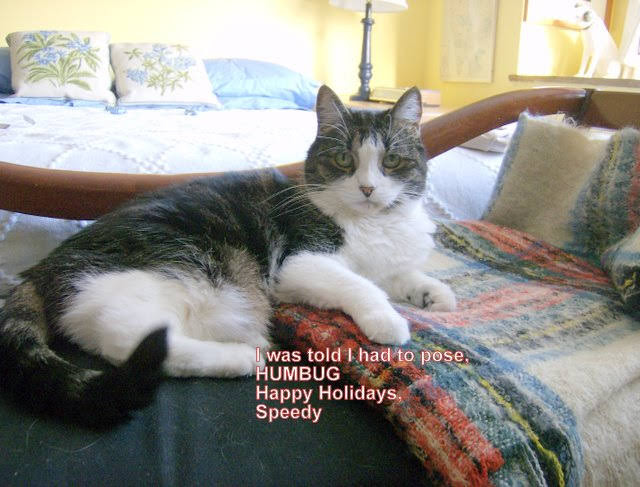
FROM A LOYAL READER Dominique. Better known as Nikita or The Cat. My human takes care of the other stuff. Have you not heard? Dogs have masters. Cats have staff.
CLARIFICATION WE ARE HAPPY TO GIVE WINNERS OF OUR DAILY PHOTO IDENTIFICATION A TRINKET FROM THE VISITOR CENTER. ONLY THE PERSON IDENTIFYING THE PHOTO FIRST WILL GET A PRIZE. WE HAVE A SPECIAL GROUP OF ITEMS TO CHOOSE FROM. WE CANNOT GIVE AWAY ALL OUR ITEMS,. PLEASE UNDERSTAND THAT IN THESE DIFFICULT TIMES, WE MUST LIMIT GIVE-AWAYS. THANK YOU
Text by Judith Berdy Thanks to Bobbie Slonevsky for her dedication to Blackwell’s Almanac and the RIHS Thanks to Deborah Dorff for maintaining our website Edited by Deborah Dorff All image are copyrighted (c) Roosevelt Island Historical Society unless otherwise indicated
Google Images (c) WILFRED LAURIER UNIVERSITY PERMANENT ART COLLECTION ALL IMAGES ARE SUBJECT TO COPYRIGHT (C)
The Miriam and Ira D. Wallach Division of Art, Prints and Photographs: Photography Collection, The New York Public Library. “Queensboro Bridge: I. From 63rd Street Pier, Manhattan.” The New York Public Library Digital Collections. 1937. https://digitalcollections.nypl.org/items/510d47d9-4f4c-a3d9-e040-e00a18064a99 FUNDING PROVIDED BY ROOSEVELT ISLAND OPERATING CORPORATION PUBLIC PURPOSE GRANTS CITY COUNCIL REPRESENTATIVE BEN KALLOS DISCRETIONARY FUNDING THRU DYCD
Herman Maril, Interior with Cat, 1972, oil on canvas, Smithsonian American Art Museum, Gift of Jules Horelick, 1972.152
Henry Wolf, Girl with Cat, 1902, photomechanical wood engraving on paper, Smithsonian American Art Museum, Transfer from the Archives of American Art, Smithsonian Institution, 1973.130.192
Chuzo Tamotzu, Cats, ca. 1935-1937, lithograph on paper, Smithsonian American Art Museum, Transfer from the Evander Childs High School, Bronx, New York through the General Services Administration, 1975.83.89
Ted Gordon, Cat, 1969, felt-tipped pen and ink and collage on paperboard, Smithsonian American Art Museum, Gift of Chuck and Jan Rosenak, 1982.114.2
Lee Hager, Cat on a Chair, n.d., color lithograph, Smithsonian American Art Museum, Transfer from the Internal Revenue Service through the General Services Administration , 1962.8.96
Will Barnet, Woman and Cats, 1962, color woodcut on paper, Smithsonian American Art Museum, Gift of Harry W. Zichterman in memory of Joshua C. Taylor, 1981.140
Saul Steinberg, Still Life with Cat, 1966, pen and ink, ink wash, colored pencil, pencil and paper collage on paper, Smithsonian American Art Museum, Gift of the artist, 1967.102.1
No one guessed the unused prison barge that is docked across from Riker’s Island. ( A blue and white elephant that is costing the city millions a year)
CLARIFICATION WE ARE HAPPY TO GIVE THE FIRST WINNER OF OUR DAILY PHOTO IDENTIFICATION A TRINKET FROM THE VISITOR CENTER. ONLY THE PERSON IDENTIFYING THE PHOTO FIRST WILL GET A PRIZE. WE HAVE A SPECIAL GROUP OF ITEMS TO CHOOSE FROM. WE CANNOT GIVE AWAY ALL OUR ITEMS,. PLEASE UNDERSTAND THAT IN THESE DIFFICULT TIMES, WE MUST LIMIT GIVE-AWAYS. THANK YOU
EDITORIAL
Maybe after such a tough season, we need to cuddle up with our feline friends. Send us your favorite feline’s photo. Enjoy springtime in November
Judith Berdy
Text by Judith Berdy Thanks to Bobbie Slonevsky for her dedication to Blackwell’s Almanac and the RIHS Thanks to Deborah Dorff for maintaining our website Edited by Melanie Colter and Deborah Dorff All image are copyrighted (c) Roosevelt Island Historical Society unless otherwise indicated
Wikipedia for both THIS ISSUE COMPILED FROM THE SMITHSONIAN AMERICAN ART MUSEUM COLLECTION
FUNDING PROVIDED BY ROOSEVELT ISLAND OPERATING CORPORATION PUBLIC PURPOSE GRANTS CITY COUNCIL REPRESENTATIVE BEN KALLOS DISCRETIONARY FUNDING THRU DYCD
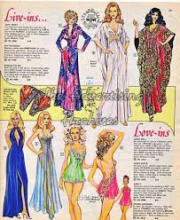
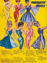
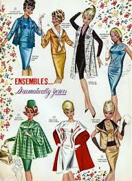
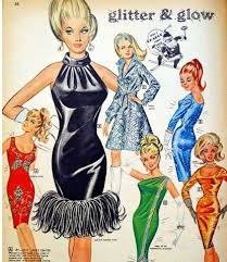
WHILE ADS AIMED AT WOMEN WERE MORE DEMURE AND LESS SEDUCTIVE
You never mentioned some words like “period”
The more tulle fabric the better
An image of the product
We all need a chandelier
THERE WAS ALWAYS FREDRICK’S OF HOLLYWOOD
MONDAY PHOTO OF THE DAY
SEND YOUR SUGGESTION TO ROOSEVLTISLANDHISTORY@GMAIL.COM WIN A SMALL TRINKET FROM THE RIHS VISITOR CENTER KIOSK. WE CAN ONLY ACKNOWLEDGE 3 WINNERS EVERY DAY. THANKS, EVERYONE WHO IS NOT MENTIONED. WE APPRECIATE YOUR INTEREST
WEEKEND IMAGE
MAGNETS FOR SALE IN RIHS VISITOR CENTER KIOSK
CLARIFICATION
WE ARE HAPPY TO GIVE WINNERS OF OUR DAILY PHOTO IDENTIFICATION A TRINKET FROM THE VISITOR CENTER. ONLY THE PERSON IDENTIFYING THE PHOTO FIRST WILL GET A PRIZE. WE HAVE A SPECIAL GROUP OF ITEMS TO CHOOSE FROM. WE CANNOT GIVE AWAY ALL OUR ITEMS,. PLEASE UNDERSTAND THAT IN THESE DIFFICULT TIMES, WE MUST LIMIT GIVE-AWAYS. THANK YOU
EDITORIAL
What a refreshing weekend this has been. Warmth and sunshine brought many of us out. I was at Coler where families were having visits with their relatives, outside in the sunshine. The island glowed in autumnal warmth.
Text by Judith Berdy Thanks to Bobbie Slonevsky for her dedication to Blackwell’s Almanac Thanks to Deborah Dorff for maintaining our website Edited by Melanie Colter and Deborah Dorff All materials in this publication are copyrighted (c)
JUDITH BERDY
MATERIAL COPYRIGHT WIKIPEDIA, GOOGLE RIHS ARCHIVES AND MAY NOT BE REPRODUCED WITHOUT PERMISSION (C) FUNDING BY ROOSEVELT ISLAND OPERATING CORPORATION PUBLIC PURPOSE FUNDING
DISCRETIONARY FUNDING BY COUNCIL MEMBER BEN KALLOS THRU NYC DYCD
What is left after training poll workers, working early voting and finally the big day on Tuesday. We do everything in bi-partisanship at the BOE. We don’t talk politics and are there to serve the voters. This year was like no other, the enthusiasm and eager workers. The voters who stood in line and thanked us for working.
THE SYSTEM WORKS
TODAY WE PASSED THE TRUMP COUNTDOWN CLOCK ON THE NYC FERRY AS THE ELECTION OF JOE BIDEN WAS ANNOUNCED.
THE VIEW THIS EVENING FROM BROOKLYN’S DOMINO PARK
From 1960………… This year-let’s all get out and Vote!
FROM STEVE BESSENOFF’S COLLECTION
A mailer from 1960.
QUALIFICATIONS TO VOTE
(WAYS TO PREVENT PEOPLE FROM VOTING) INCLUDED: POLL TAX, LOYALTY OATH AND LITERACY TEST. EVEN NEW YORK HAD A LITERACY TEST CHECK OUT WHAT STATES DEMANDED OF VOTERS
HOW STATES VOTED 1860- 1956
SEE HOW STATES TURNED FROM ONE PARTY TO ANOTHER FROM 1944 TO 1956
THE ELECTORAL COLLEGE TALLY SHEET FOR 1960
Funding Provided by: Roosevelt Island Operating Corporation Public Purpose Funds, Council Member Ben Kallos City Council Discretionary Funds thru DYCD
COLLECTION OF
STEVE BESSENOFF
Edited by Deborah Dorff ALL PHOTOS COPYRIGHT RIHS. 2020 (C)
PHOTOS IN THIS ISSUE (C) JUDITH BERDY RIHS
EDITORIAL
Steve gave me this literature from Esso. It was a mailer that was sent our to customers from your local gas station.
It is shocking to see that there were poll taxes, literacy taxes and loyalty oaths in 1960. Residency requirements by state, county and election district were another way of voter supression, especially in the south.
Yes, in New York there was a literacy test!
I can provide you with a clear copy of these pages if you request.
“Helvetica, once the hippest design choice in town, then ubiquitous, then tired, has come back into style.” Read the essay by Christopher Bonabos
In 1970 the subway system was a mess of mismatched signage, convoluted routings and was a obstacle course to find your train. A project was taken on by Bob Noorda, Massimo Vignelli and Unimark to re-imagine the look of our subway system graphics.
Images of the Original Standards Manual
Stand Clear. by Christopher Bonanos
The New York City subway, harsh and intrusive as it is, offers a paradoxical bubble of solitude to those who want it. Though the trains are noisy, and each contains a small town’s population at rush hour — nearly 2,000 people, a few of whom always have headphones blaring at loudspeaker levels — a commuter onboard can often recede, losing him- or herself in a form of privacy unique to a city of millions. The subway is (for the time being, anyway) mostly a place where cell phones don’t ring and e-mails don’t ping. If you’re not reading or playing a computer game as you wait, odds are you’re gazing into the middle distance, gaining strength from those few minutes when nobody is asking anything of you.
The middle distance, though, is not empty. A subway station is full of interesting things to look at. Mosaics. Bare-bulb light sockets next to, and superseded by, far more powerful fluorescence. Lively advertising, flanked by lousy advertising. Here and there, a cockroach or a rodent. And, of course, signs. Each of them contains relatively few words, sometimes just one or two, and they are not only placed in the middle distance; they are deliberately hung where you are supposed to see them. Bored eyes, accustomed to stimulation, tend to settle on even just a few letters.
The background of each is black, the letters white. The older signs are enamel on steel, with thickness and gloss to the porcelain; some newer ones are made with adhesive vinyl films in matte finishes. The train lines are indicated with discs in ten official colors. Important details, like exits and warnings, are on red and yellow backgrounds. A slim white band across the top of nearly every sign demarcates… something. (More about that later.) The typeface is Helvetica, that avatar of modern efficiency, except when it isn’t. (More about that too.) The graphics are markedly consistent, with just enough oddities to make the whole thing interesting, and they have become nearly as pervasive a symbol of New York City as yellow taxicabs and Art Deco skyscrapers are. By and large the system all makes sense, despite its failings. It took decades to make that consistency happen, and the 1970 New York City Transit Authority Graphics Standards Manual, reproduced in these pages, is where the whole project began.
In the mid-nineteen-sixties, the New York subway system was heading into the worst stretch in its history, and maybe the worst stretch that any big transit system will ever have. In fact, a lot of people were writing off New York City itself. For more than a century, it had been a manufacturing town, its big airy loft buildings cranking out machine parts, Oreos, paper boxes, printed matter, refined sugar, you name it. Millions of immigrants had arrived expressly to work in its factories.
In 1960, 95 percent of the clothing sold in America had come from the cutting tables and sergers of Manhattan’s garment district. Modern manufacturers, though, needed wide-open floors and truck-loading bays, not lofts on narrow streets with funky old elevators. By the sixties, the South and the West, offering clean new space and cheap labor, had begun to draw people away. Between 1969 and 1976, 600,000 jobs left New York. After a century in which the city’s population had increased nearly tenfold, it was losing people for the first time. A recession that began in 1968 cut into tax revenue, unemployment increased the demands on social-service programs, and the city’s solution was to borrow heavily every year. New York was going broke. On top of that, the subways were simply old, and looking older.
Since the 1920s, Robert Moses — the grand czar of urban planning, holding more consolidated power than the mayor or the governor — had pushed for more and more parkways, more and more buses, and not a dime more than was necessary for rail. His view had been the prevailing one of his generation. Cars were the versatile future; trains were the fixed-route past. In 1963, the wrecking ball hit Pennsylvania Station, a building that was worth less than the site on which it stood despite its irreplaceable grandeur. Public railways came with baggage of another kind — regular squabbles between labor and management — and in 1966 a strike shut the whole transit system down for almost two weeks. Never mind that the exhaust and traffic of car culture were beginning to bring problems of their own; never mind, too, that about 4 million people still rode the subway on an average workday. Moses held all the cards, and he dismissed those who, he sneered, “shout for rails and inveigh against rubber.”
Lack of money led to neglect. In these years, the prevailing practice of the NYCTA was called “deferred maintenance.” At any other time, taking care of the equipment — replacing track, greasing bearings, work like that — would have been done on a schedule, steadily. In a cash-poor environment, those processes were put off, over and over again. If a subway car should be painted every three years, and at the end of three years there’s a budget shortfall, you can delay the job a fourth year, and almost nobody will notice. At five years, it’ll become evident; at seven, the train will look seedy. But it’s not the immediate effect that’s the problem. In that time, a little rust may get going under the paint, or mechanical parts will wear past the point of no return, and you will have invisibly but palpably shortened that subway car’s life. Deferred maintenance meant borrowing against the future. In many cases, the maintenance was deferred indefinitely — that is, nothing was replaced until it actually broke, even if that meant it might happen in the middle of rush hour, backing up the lines for miles. The results were catastrophic.
Trains were grinding to a halt; signals and lights failed constantly; trash on the tracks caught fire; doors jammed. There were (notes the subway historian Marc Feinman) hundreds of stretches of bad track on which motormen had to stay under 10 miles per hour. Flat spots on worn steel wheels made the trains far louder than they should have been. On older cars, some of which were approaching 50 years’ service, the rattan seating was breaking down, snagging commuters’ clothes and stockings. Even when clean new trains arrived in the early seventies, they turned out to have reliability problems. Ridership was plunging — in 1976, it was half what it had been in 1949 — and the nearly deserted stations in turn provided new opportunities for crime. The whole system looked like hell, and perpetually seemed to be getting worse.
It had all been graceful, long ago. In 1904, when the first line was opened by the private Interborough Rapid Transit Company, neoclassical ornament dominated. The architects, a firm called Heins & LaFarge, specified ceilings with bands of wedding-cake detailing between the structural arches. Ticket booths were oak, with bronze grilles. The stations received unique faience plaques along the walls — American eagles by the armory at 33rd Street, the Santa María at Columbus Circle, and (most eccentrically, and charmingly) beavers at Astor Place, commemorating John Jacob Astor’s fur trade.
The station names themselves were rendered in mosaic tiles, with extraordinary delicacy of color and line. The stations built in the 1930s under another architect named Squire Vickers are more severe, but they too show the hand of an aesthete, and a machine-age strength that suits New York. The prevailing attitude is plain to see: The American century lies ahead, and this city is ready for it, with trains that run all night. As the urban fabric rippled out into Brooklyn and Queens and the Bronx, the train system that served it grew extremely complex.
Two more networks were constructed, augmenting and eventually competing with the IRT: the city-owned Independent Subway (or IND), and the private Brooklyn Rapid Transit System, later reorganized as the Brooklyn-Manhattan Transit Corporation (BMT). They quickly became essential. Yet, as World War I and then the Great Depression set in, all three struggled financially, owing to a city requirement that they keep the fare at a nickel. (There were no fare increases from 1904 to 1948, and it showed in the system’s shabbiness.)
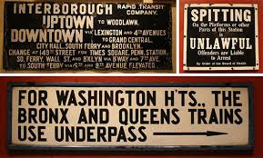
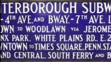
In 1940, after the IRT went bankrupt, all three were merged under municipal control, creating an organization that eventually became the New York City Transit Authority. Because they’d been built separately, the stations were poorly knitted together, and navigating them was a kind of local craft, learned by feel and word of mouth. Yes, there were signs to tell you where to go, and yes, they helped a little. Most were white porcelain enamel on steel, though many of the large ones were forest green or cobalt blue. There was an artisanal beauty to them.
The typography — although you can’t really call it “type”; it was more a version of handdrawn lettering — often varied in size, with small words like AND or VIA subordinated in size. Ornate arrows curled to indicate stairways or unusual exits. Names were often abbreviated in entertainingly weird ways: BL’KER ST. for Bleecker Street, FORD’M RD. for Fordham Road. They were gorgeous, tactile objects. But as a way of getting you to your destination? This was the text you faced as you entered an IRT station (today’s 4 train) in Harlem or the southern
Bronx: I N T E R B O R O U G H RAPID TRANSIT CO. UPTOWN TO WOODLAWN. DOWNTOWN VIA LEX. AND 4th AV. TO GRAND CENTRAL, CITY HALL, SOUTH FERRY AND BROOKLYN CHANGE AT 149th ST. FOR TIMES SQ. , PENN STATION, SOUTH FERRY, WALL STREET AND BROOKLYN VIA BROADWAY AND 7th AVENUE. TO SO. FERRY VIA 6th AND 9th AVE. ELEVATED.
What? Why do I have to change for South Ferry when this train already goes to South Ferry? And do I change at 149th, or later on, to the 6th and 9th Avenue El? For god’s sake, I just want to get to Gimbels!
The essay continues on: https://standardsmanual.com/products/nyctacompactedition
You can own your own copy of the Standards Manual. See above website.
COLUMBUS CIRCLE STATION Lots of correct guesses including Hara Reiser, Vicki Feinmel, Andy Sparberg, Clara Bella
Funding Provided by: Roosevelt Island Operating Corporation Public Purpose Funds, Council Member Ben Kallos City Council Discretionary Funds thru DYCD
1970 New York City Transit Authority Graphics Standards Manual
Designed by Massimo Vignelli and Bob Noorda, Unimark, 1970 (c)
Edited by Deborah Dorff ALL PHOTOS COPYRIGHT RIHS. 2020 (C)
PHOTOS IN THIS ISSUE (C) JUDITH BERDY RIHS
EDITORIAL
Some subjects are addictive. The subway is one of them. There are so many wonderful stories to tell. We wrote about the decor and glory of Vickers designs the other day. In the 1960’s the hodge podge of merged lines and construction was deemed in need of replacement.
I remember when many station walls were covered over with bland decor in the 1970’s. Luckily the original tile work was not removed and many years later the “improvements” were removed and the original tiles with windmills, beavers and glorious lettering was restored.
Yes, the MTA does do good things!!!
When you are at Columbus Circle check out the sample tile work on the uptown #1 platform.
The story of Squire Vickers, the man behind the distinctive look of the New York City subway By KERI BLAKINGER NEW YORK DAILY NEWS | JUN 30, 2016 AT 8:15 AM
Squire Joseph Vickers (seen in his Class of 1900 Cornell yearbook) oversaw subway design for more than three decades. (Cornell University)
You’ve probably never heard of him, but an eccentric man from Rockland County is one of the people most responsible for the look and feel of the New York City subway system. Squire Vickers, the system’s chief architect for more than three decades, oversaw the design of more stations than any other individual — and he left his stamp on the system, with signature tile station plaques and a distinct Arts and Crafts design that permeates the system to this day.
To understand Vickers’ style, though, first it’s necessary to understand what came before him. When the first subway opened in 1904, it had been designed by ecclesiastical architects — church designers. Today, the subway might seem like the most unholy of places, but the system’s first architects — MIT grads George L. Heins and C. Grant LaFarge — were best known for winning the competition to design the Cathedral Church of St. John the Divine.
In 1901, according to the New York Times, they snagged the job as chief architects for the first subway line, which would run from City Hall up to 145th St. The City Hall station was the crown jewel of the Interborough Rapid Transit subway line, featuring elegant Tiffany skylights and ornate Gruby faience tiles.
Like the other 1904 stations, City Hall was influenced by the Beaux Arts movement, a Parisian neoclassical style of architecture.
“That was an aesthetic that architects at the time were embracing,” MTA Arts & Design Director Sandra Bloodworth told the News.
“They were also evoking the City Beautiful movement showcased at the Chicago World’s Fair, with the hope that if you created these great public spaces it would bring out the higher civic nature of the people.”
Heins and LaFarge stations are often identifiable by those plaques. If the plaques feature the depth of ornate bas relief, you’re probably in a 1904 station. Those early Heins and LaFarge stations are filled with swoops and swirls and architectural flourishes. Also, they’re only on the numbered lines — the lettered lines were built later.
Squire Vickers — who undoubtedly has the coolest name in New York transit history — was an eccentric painter who graduated from Cornell University, according to the New York Times. He lived north of the city— in a Rockland County town called Grand View-on-Hudson — in an Arts and Crafts-style home he designed. The interior of his artist’s retreat was decorated with tiles, much like an upstate subway outpost.
When he wasn’t masterminding the look of the then-biggest underground transit system in the world, Vickers passed the hours painting and writing Romantic poetry. Though he was not a New Yorker, he was a regular subway rider; his daily commute to Manhattan included jaunts on the train, ferry and subway. When he took over as the system’s chief architect, he brought his own sensibilities to the system.
When Vickers took over subway design, he went for an easier-to-maintain Arts and Crafts style that relied heavily on colorful tiled mosaics.
“He was an architect and then he became the primary architect for station design beginning in 1908 till the 1940s,” transit historian and “From a Nickel to a Token” author Andy Sparberg explained. “His stations encompass two types.” First, he oversaw the stations influenced by the Arts and Crafts style. They are less ornate — and easier to maintain — than their Beaux Arts predecessors. Gone were the three-dimensional bas reliefs and swirling flourishes, as curves gave way to straight lines and faiences to vividly colored mosaic tiles and geometric designs.
The Rector St. subway stop features Vickers’ work, as do many of the other stops south of Times Square. (Gryffindor/Wikimedia Commons)
Although some of Vickers’ affection for the simplicity of Arts and Crafts style was undoubtedly about aesthetics and ethos, some of it was probably about dollars and cents. “With Heins and LaFarge,” Transit Museum curator Carissa Amash told the Times in 2007, “there was a point at which it was like, ‘Hey guys, you’re going to have to rein in the costs,’ but with Vickers it was pretty much a tight budget from the get-go.” Some of the most striking examples of his work can be found on many of the local stops south of Times Square — Rector St., Franklin St., Houston St. The geometric mosaic bands along the walls of the Times Square complex, the City Hall mosaics at the R train’s City Hall stop and the train mosaics at Grand Central are all vivid examples of Vickers’ work.
Vickers oversaw the design of the 14 St.-Union Square subway station, which features this tile design. (Keri Blakinger/New York Daily News)
Over time, though, his style shifted. When the city decided to erect the Independent Subway System — better known as the IND — Vickers imbued the new stations with a noticeably different aesthetic. “When the city began building IND stations opening in 1932, they adapted Machine Age design, a variant of Art Deco,” Sparberg explained. Machine Age sensibilities were more streamlined and bolder, evoking a feeling of modernity and precision. As that influence took over, the station name tiles shifted to sans-serif fonts and solid colors. The old IND stations — which correspond to lettered lines after H — feature austere mosaic name tiles with sharp edges and bold colors. They’re vibrant and lively — but straight-to-the-point and all business.
The IND stations have a distinctly different tiling theme from the stations that came before them. (Youngking11/Wikimedia Commons) Although Vickers would have overseen the IND station design, Bloodworth cautioned that it’s not certain how hands-on he was in the bold tiling that defines the look of the IND platforms today. “I’ve always wondered who really did that because it’s so different from his sensibilities,” she said. Above all, his sensibilities focused on a fundamental belief that better art made for better people. “If we start out to find that which is best in art, it will permeate the entire life and rule of action,” he once wrote.
SPORTS FIELDS ON RANDALL’S ISLAND ANDY SPARBERG CLARA BELLA JOAN BROOKS WERE THE EARLY BIRDS
Text by Judith Berdy Thanks to Bobbie Slonevsky for her dedication to Blackwell’s Almanac and the RIHS Thanks to Deborah Dorff for maintaining our website Edited by Melanie Colter and Deborah Dorff Roosevelt Island Historical Society MATERIALS USED FROM:
The story of Squire Vickers, the man behind the distinctive look of the New York City subway
By KERI LAKINGER NEW YORK DAILY NEWS |(C) JUN 30, 2016 AT 8:15 AM
FUNDING PROVIDED BY ROOSEVELT ISLAND OPERATING CORPORATION PUBLIC PURPOSE GRANTS CITY COUNCIL REPRESENTATIVE BEN KALLOS DISCRETIONARY FUNDING THRU DYCD
TUGBOAT SAILING BY CENTRAL NURSES RESIDENCE WHERE 455 NOW STANDS. RITA MEED WAS THE WINNER!!
PHOTO OF THE YEAR
OUR GREAT POLL WORKERS AFTER A DAY WORKING AT PS217!!
MEMORIES
CLARIFICATION WE ARE HAPPY TO GIVE WINNERS OF OUR DAILY PHOTO IDENTIFICATION A TRINKET FROM THE VISITOR CENTER. ONLY THE PERSON IDENTIFYING THE PHOTO FIRST WILL GET A PRIZE. WE HAVE A SPECIAL GROUP OF ITEMS TO CHOOSE FROM. WE CANNOT GIVE AWAY ALL OUR ITEMS,. PLEASE UNDERSTAND THAT IN THESE DIFFICULT TIMES, WE MUST LIMIT GIVE-AWAYS. THANK YOU
Text by Judith Berdy Thanks to Bobbie Slonevsky for her dedication to Blackwell’s Almanac and the RIHS Thanks to Deborah Dorff for maintaining our website Edited by Melanie Colter and Deborah Dorff All image are copyrighted (c)
MICHEAL FRANK PHOTOS PART OF THE RIHS ARCHIVES
FUNDING PROVIDED BY ROOSEVELT ISLAND OPERATING CORPORATION PUBLIC PURPOSE GRANTS CITY COUNCIL REPRESENTATIVE BEN KALLOS DISCRETIONARY FUNDING THRU DYCD
Clyde J. Singer (1908-1999), East River, 1938, oil on canvas, 32 x 40 ¼ in.
Born in 1908, in Malvern, Ohio, forty miles south of Akron, Clyde Singer became known for his Social Realist and American Regionalist paintings and watercolors. His style and subjects were inspired by the Ash Can artists Robert Henri and John Sloan as well as the American Scene painters John Steuart Curry and Grant Wood. He studied at the Art Students League beginning in 1933, and his teachers included Curry and Thomas Hart Benton, among others.
The two artists that he admired most were George Bellows and John Sloan, and in non-classroom hours, he sought out locations where they had painted. Singer had the opportunity of meeting Sloan and developed a friendship with him, hearing stories about The Eight. Returning to Ohio, he became recognized as a talented up-and-comer in the realm of American Scene painting. From 1935 to 1940, Singer began selling paintings and became more recognized as he participated in over eighty-two exhibitions in fifty-six cities.
East River, 1938, has the appearance of an Ash Can subject, focusing upon urban life along the river on the Eastside of Manhattan. Here, a trio of young women, perhaps office workers, are in intense conversation, while two children, with their backs turned, watch a classic New York City tugboat creating a spew as well as workmen on the opposite shore. The shore opposite the promenade is a site on Welfare Island (now Roosevelt Island since 1973), a tract of land in the river between Manhattan and Queens, just north of the Queensboro, now Ed Koch, Bridge. In the painting, workmen are engaged before the several storied building, which would open the following year (1939) as the Goldwater Memorial Hospital, the Welfare Island Hospital for Chronic Diseases (thel building was razed in 2014).
Although back in Ohio in 1938, the artist was clearly enamored with New York and continued to paint scenes of the City, as he did throughout his life. The year of East River proved a laudatory one for Singer, as he won a prize at the National Academy of Design for Barn Dance (private collection).
WEDNESDAY PHOTO OF THE DAY
PART OF OUR WONDERFUL GROUP OF POLL WORKERS WHO HELPED OVER 1850 ISLANDERS CAST THEIR BALLOTS
A SPECIAL THANKS TO OUR GREAT GROUP OF YOUNG, ENERGETIC LINE MONITORS!!!
TUESDAY’S PHOTO OF THE DAY
ANDY SPARBER AND OTHERS THAT I WILL POST SOON.
EDITORIAL
AFTER 100 HOURS AT EARLY VOTING AND 16 HOURS TODAY, I AM GOING TO CELEBRATE OUT 200TH ISSUE LATER IN THE WEEK.
JUDITH BERDY
SUPPORT THE RIHS AND SHOP THE KIOSK
OPEN WEEKENDS 12 NOON TO 5 P.M. ORDER ON-LINE BY CHARGE CARD
CLARIFICATION WE ARE HAPPY TO GIVE WINNERS OF OUR DAILY PHOTO IDENTIFICATION A TRINKET FROM THE VISITOR CENTER. ONLY THE PERSON IDENTIFYING THE PHOTO FIRST WILL GET A PRIZE. WE HAVE A SPECIAL GROUP OF ITEMS TO CHOOSE FROM. WE CANNOT GIVE AWAY ALL OUR ITEMS,. PLEASE UNDERSTAND THAT IN THESE DIFFICULT TIMES, WE MUST LIMIT GIVE-AWAYS. THANK YOU
Text by Judith Berdy Thanks to Bobbie Slonevsky for her dedication to Blackwell’s Almanac and the RIHS Thanks to Deborah Dorff for maintaining our website Edited by Deborah Dorff All image are copyrighted (c) Roosevelt Island Historical Society unless otherwise indicated
Google Images (c)
ALL IMAGES ARE SUBJECT TO COPYRIGHT (C)
FUNDING PROVIDED BY ROOSEVELT ISLAND OPERATING CORPORATION PUBLIC PURPOSE GRANTS CITY COUNCIL REPRESENTATIVE BEN KALLOS DISCRETIONARY FUNDING THRU DYCD