Through foregrounding the growth, evolution, and creation of the organic materials found within Wave’s works of art, Webster brings the exhibit into direct conversation with the natural world. In addition, striking connections are made between the past and present. Wave is rooted in the historical art movements of minimalism and land art while simultaneously engaging with contemporary conversations surrounding nature, ecology, sustainability, and technology.
Curated by Alice Russotti and located in The Arts Center’s Upper Gallery, Wave masterfully connects the audience to its natural landscape components while highlighting the important role humans play within our planet’s ecological biomes. Drawing from a selection of pieces from Meg Webster’s career, which first began during the 1980s, Wave emphasizes the artist’s continued commitment to exploring nature in her work.
Largest Blown Spheres,Courtesy of Lower Manhattan Cultural Council.Photo by Ian Douglas
“[Webster’s] passion and commitment to presenting [nature’s] radical content is intoxicating and drive’s one to learn more about the world around us that we so often not only overlook but also misuse,” Russotti said. “Through a visual language of poetic simplicity and physical directness, she shows us that the simplest of organisms exist because of a universe of wonderfully complex interconnecting systems.”
Moss Mound
Wave is split into six distinct sections. With nothing separating each from the other, visitors can move through the gallery as if they have become another living and evolving entity transplanted into its confines, only to later be returned to the outside world upon exiting. The first section, Waterfall, consists of projections of the Houston Brook Falls in Maine from 1996. The recordings perfectly capture the area’s idyllic landscape, honing in on the waterfalls‘ serenity. Directly in front of Waterfall is Largest Blown Spheres, a series of five blown glass orbs. Made from human breath, the orbs are the largest size possible without using artificial means, connecting them to one of the world’s most important natural organisms.
To the right of the orbs is Moss Mound—created in 2021 within The Arts Center. Reaching just below eye level, Moss Mound presents the rolling hills of nature in a beautifully condensed form. Its curves break up the gallery’s rectangular space. Adding to the gallery’s reflection on nature is Nearest Virgin Forest, a chorus of unedited bird and insect field noises that can be heard while traversing the space. First recorded in 1987 and then again in 2021, the sounds emanate from the Hutcheson Memorial Forest, one of the last uncut forests within the Mid-Atlantic region.
Growing Piece, Courtesy of Lower Manhattan Cultural Council,.Photo by Ian Douglas.
The final two works—Growing Piece and Pollinating Garden—both created in 2021, interconnect with their shared usage of organic materials, space, and time. At 54 feet long, Growing Piece sits across the gallery’s floor as a living nursery for plants located in Pollinating Garden, just a short walk away on Governors Island at GrowNYC’s Teaching Grove. Over the season, seeds germinated within Growing Piece will be transported to Pollinating Garden and elsewhere across Governors Island to continue their natural life-span while also serving the environment’s bees, butterflies, insects, and pollinating plants. In doing so, Wave is brought into direct conversation with Governors Island’s ecosystem.
“The unique context of The Arts Center and Governors Island is central to the work presented, providing audiences with opportunities to inquire into these systems and environments that bend, fluctuate and connect us, while creating possibilities for conversations and change,” Lili Chopra, Executive Director of Artistic Programs at LMCC, said.
Onyedika Chuke’s The Forever Museum Archive_Circa 6000BCE
Dismembered feet of Hermes in Reflection Pool, Courtesy of Lower Manhattan Cultural Council. Photo by David Gonsier.
The Forever Museum Archive_Circa 6000BCE project, located in the Lower Gallery of the Arts Center, focuses on creating social change in the context of the United State’s criminal justice system. Utilizing sculptures as an archival form of investigation, orphaning, and rehoming mythical markers, Onyedika Chuke works to expose the less visible but deeper psychological meanings they shroud. Co-commissioned by LMCC and Pioneer Works, the exhibition traverses the history of the United States’ penal codes from antiquity to today.
Chuke was inspired to create The Forever Museum Archive during his time collaborating with incarcerated individuals as a New York City Public Artist-in-Resident at Rikers Island from 2018 to 2019. There, Chuke fought to create better access to the arts and foster dialogue between New York City policymakers and individuals in custody. This connects to his installation’s larger goal of shifting debates surrounding the purposes behind the United State’s justice system to critically examine how it came to be and the powers which have kept it alive.
Labyrinth of Quaker church pews.
As Gabe Florenz, Curator for Pioneer Works, commented, “His work immediately stands out on a visceral level and once you start to look closer you realize there are layers and layers you can peel back.”
Upon entering The Forever Museum Archive, visitors are immediately introduced to a labyrinth of Quaker church pews. These pews connect to the Christian Church’s involvement in establishing the first institution for the punishment of criminals in the United States. A Renaissance painting—a tool commissioned by the Church to promote their belief system over all others—in the foreground further highlights the ways in which capital and religion intersect with the carceral system. Interspersed between the pews are two of Chuke’s new hand-sculpted works created in replication of the decapitated head and dismembered feet of the Greco-Roman deities Hercules and Hermes. In encasing these sculptures within the pews, Chuke works to subvert the mythologized notion of heroism in Euro-American philosophy.
Painting of the Death of Saint Anne by Fabrizio Chiari, Courtesy of Lower Manhattan Cultural Council.Photo by David Gonsier.Severed head of Hercules, Courtesy of Lower Manhattan Cultural Council. Photo by Onyedika Chuke.
To the left of the gallery is another sculpture molded to resemble the structures of the human body’s thoracic spine. It serves as the point of origin for a series of plastic tubes pumping a solution of liquid soap throughout the exhibition. The cleaning product used was specifically chosen as it was produced by Corcraft Industries—the brand name for New York State’s Division of Correctional Industries. With Corcraft paying its incarcerated workers just 16 cents an hour, the tubes and soap were created by Chuke to critique the exploitation of prison labor. In a way, as the tubes travel across the floor, they could represent our body’s central nervous system, highlighting the pervasive cycle of oppression and injustice found within the United States today.
Thoracic spine inspired sculpture.
For Chopra, “As the site of The Forever Museum Archive_Circa 6000BCE, Governors Island is a potent stage for these layered and interconnected dynamics, as the land of the Lenape, the Island’s original inhabitants; in its later colonization and use as a military base; and presently as a space for public life and social engagement.”
Muna Malik’s Blessing of the Boats
Blessing of the Boats, Courtesy of Lower Manhattan Cultural Council. Photo by Muna Malik.
As the final exhibit on display at The Arts Center at Governors Island this year, Muna Malik’sBlessing of the Boats is an outdoor interactive steel boat-shaped sculpture. Over the years, Malik has worked to generate cultural awareness in connection to the arts, with her most recent work focusing on capturing the narratives of women and refugees of color through poetry.
Blessing of the Boats seeks to foster collective empathy and action through individual engagement by asking its viewers to consider the prompt: “We have an opportunity to set sail towards a new future—what society would you build and how do we get there?”
Side view of Blessing of the Boats, Courtesy of Lower Manhattan Cultural Council.Photo by Ian Douglas.
To do so, visitors are encouraged to create origami boats in which they can write their answer to the suggested prompt before placing it into the crevices lining the sculpture’s structure. Inside the Arts Center, sealed packets with materials to create the boats can be found, allowing anyone to participate in the sculpture’s effort of collecting the thoughts and dreams of all its visitors.
MAYOR FIORELLO LA GUARDIA AND WIFE M. FRANK, JAY JACOBSON, GLORIA HERMAN ALL GOT IT
IF I MISSED YOUR NAME, WE WERE AT THE POLL SITE LATE TONIGHT!!
Text by Judith Berdy Thanks to Bobbie Slonevsky for her dedication to Blackwell’s Almanac and the RIHS Thanks to Deborah Dorff for maintaining our website Edited by Melanie Colter and Deborah Dorff
All image are copyrighted (c) Roosevelt Island Historical Society unless otherwise indicated
Be advised that the NYC Mobile Vaccine Clinic is on site to provide the COVID-19 vaccination to the Roosevelt Island Community.
The mobile van will be located in the Riverwalk area outside of 460 Main St., Monday, June 21st through Friday, June 25th, each day from 8 AM to 6 PM.
TUESDAY, JUNE 11, 2021
The
396th Edition
From the Archives
What an artist captured
on
1950s Orchard Street
FROM EPHEMERAL NEW YORK
What an artist captured on 1950s Orchard Street
When Joseph Sherly Sheppard painted these three scenes of Orchard Street in the 1950s, this eight-block stretch of the Lower East Side was devoted to cut-rate commerce.
Unglamorous tenement storefronts jockey for space, merchandise spills onto the sidewalk, and sign after colorful sign advertised such utilitarian items like coats, linens, eyeglasses, and hosiery.
Orchard in the 1950s seems emptier than it had been in the early decades of the 20th century, when it was a packed Jewish immigrant enclave.
Commerce continues to reign on Orchard today, and some blocks still have the feel of a mid-20th century flashback. But like so much of today’s Lower East Side, this old city street (named for the orchards that once graced the 18th century DeLancey estate) is glammed up with new condos, restaurants, and trendier, higher-end stores. Older ladies carrying bulging shopping bags are a rarer sight these days.
Born in Maryland in 1930, Sheppard has had a long career as a realist painter. He painted unique scenes of humanity, from sunbathers to circus performers to grape pickers. Most of his work depicts places other than New York City. But something drew him to Orchard Street. Sheppard once again painted Orchard Street in 1982: it’s a scene outside a clothing store that displays its wares like an open-air market.
The 1982 painting is similar to those from the 1950s (the “I Love NY” shirt confirms its era): clothes hang over the sidewalk, pedestrians and delivery people go about their business, and the occasional curious customer contemplates a deal.
[First and second images: Artnet.com; third image: Invaluable.com; fourth image: Artnet.com]
Tags:Joseph Sheppard New York City paintings, Joseph Sheppard Orchard Street, Joseph Sherly Sheppard painter, New York in the 1950s, Orchard Street 1950s New York, Orchard Street Shopping 1950s
THE ICE CREAM FREEZER AT CORNELL TECH CAFE VICKI FEINMEL, LISA FERNANDEZ, JOAN BROOKS, GLORIA HERMAN, JINNY EWALD, & LINDA BECKER HAVE ALL HAD PERSONAL VISITS TO THIS SITE
OOOPS! WE FORGOT TO THANK THE 400 VOTERS WHO TOOK THEIR TIME TO VOTE EARLY AND SUPPORT THE EFFORT.
THANKS TO RICK AND DAVID FOR PUBLICIZING THE EFFORT.
JUDYB
A VERY BIG THANK YOU! THE LAST 10 DAYS WE HAVE PREPARED AND HAD A EARLY VOTING SITE AT SPORTSPARK. WE THANK REBECCA SEAWRIGHT FOR GETTING THE SPACE DESIGNATED BY THE BOARD OF ELECTIONS. WE THANK RIOC FOR THE USE OF SPORTSPARK WE THANK THE SPORTSPARK STAFF WHO WERE GREAT HOSTS WE THANK PSD FOR GETTING US IN THE BUILDING AND PATROLLING. WE THANK NYPD FOR BEING ON SITE EVERY DAY WE THANK CORNELL TECH FOR BEING SUCH GREAT NEIGHBORS AND THE CORNELL CAFE FOR FEEDING US. WE THANK GRADUATE HOTEL STAFF FOR WELCOMING ALL OUR CURIOUS WORKERS. WE THANK FOODTOWN FOR REFRESHMENTS WE THANK EVERYONE WHO MADE MANY OF OUR OFF-ISLAND WORKERS WELCOME ON OUR ISLAND. THE VISITING POLL WORKERS WERE SURPRISED TO SEE OUR WONDERFUL ISLAND AND ENJOYED WORKING HERE. ALL OUR WORKERS WERE GREAT THE ONLY THING WE MISSED WERE VOTERS WE HAD SUCH A POOR TURNOUT OF VOTERS, THAT WE DOUBT WE WILL GET EARLY VOTING ON THE ISLAND AGAIN. JUDY BERDY
Text by Judith Berdy Thanks to Bobbie Slonevsky for her dedication to Blackwell’s Almanac and the RIHS Thanks to Deborah Dorff for maintaining our website Edited by Melanie Colter and Deborah Dorff Sources
EPHEMERAL NEW YORK
Text by Judith Berdy Thanks to Bobbie Slonevsky for her dedication to Blackwell’s Almanac and the RIHS Thanks to Deborah Dorff for maintaining our website Edited by Melanie Colter and Deborah Dorff
FUNDING PROVIDED BY ROOSEVELT ISLAND OPERATING CORPORATION PUBLIC PURPOSE GRANTS CITY COUNCIL REPRESENTATIVE BEN KALLOS DISCRETIONARY FUNDING THRU DYCD
THE LAST 10 DAYS WE HAVE PREPARED AND HAD A EARLY VOTING SITE AT SPORTSPARK. WE THANK REBECCA SEAWRIGHT FOR GETTING THE SPACE DESIGNATED BY THE BOARD OF ELECTIONS. WE THANK RIOC FOR THE USE OF SPORTSPARK WE THANK THE SPORTSPARK STAFF WHO WERE GREAT HOSTS WE THANK PSD FOR GETTING US IN THE BUILDING AND PATROLLING. WE THANK NYPD FOR BEING ON SITE EVERY DAY WE THANK CORNELL TECH FOR BEING SUCH GREAT NEIGHBORS AND THE CORNELL CAFE FOR FEEDING US. WE THANK GRADUATE HOTEL STAFF FOR WELCOMING ALL OUR CURIOUS WORKERS. WE THANK FOODTOWN FOR REFRESHMENTS WE THANK EVERYONE WHO MADE MANY OF OUR OFF-ISLAND WORKERS WELCOME ON OUR ISLAND. THE VISITING POLL WORKERS WERE SURPRISED TO SEE OUR WONDERFUL ISLAND AND ENJOYED WORKING HERE. ALL OUR WORKERS WERE GREAT
THE ONLY THING WE MISSED WERE VOTERS
WE HAD SUCH A POOR TURNOUT OF VOTERS, THAT WE DOUBT WE WILL GET EARLY VOTING ON THE ISLAND AGAIN.
JUDY BERDY
Many tourists to Roosevelt Island think of it as a quickly modernizing two-mile long island with high-rises, a new Cornell University campus, and waterfront structures with views of Manhattan. Yet much of the island’s dark history has eroded away — along with some of its historic buildings. The Renwick Ruin was originally built in 1856 on the southern end of Roosevelt Island as part of a series of prisons and hospitals constructed on the island during that time. Designed by architect James Renwick, Jr. as the nation’s first hospital dedicated to the treatment of smallpox, the structure is breathtaking in its abandonment and stands as our city’s only landmarked ruin. As the building continues to slowly deteriorate, efforts to stabilize the structure and increase public access highlight the importance of preserving this rare piece of New York City history.
Recently released is the new short film Unforgotten: Renwick Ruin by artist Aaron Asis, Untapped New York’s Artist in Residence. Asis and his team at Green Ghost Studios were given special access inside the abandoned structure and the film showcases perspectives of the Renwick ruin that are rarely seen by the public. We’ll be hosting a premiere of the film in our upcoming event, Unforgotten: The Renwick Ruin on July 15th, featuring Asis and Stephen Martin, Founder of Friends of the Ruin and the former Director of Design & Planning for FDR Four Freedoms Park Conservancy. In the event, see rare video and photographic imagery from inside the remnant structure, hear from the experts associated with the Ruin about the value of the ruin for our city, and hear from the advocates working closely with the Ruin about current preservation efforts. The event is free for Untapped New York Insiders —get your first month free of membership with code JOINUS.
The Renwick Ruins are what remains of the Renwick Smallpox Hospital and later the Maternity and Charity Hospital Training School. The 100-bed hospital opened on what was at the time known as Blackwell’s Island. Although the smallpox vaccine first was developed in 1796, New York City still experienced large smallpox outbreaks. This was due in part to increased immigration from countries where the vaccine was not readily available. The hospital was specifically built on the island’s southern tip to quarantine the ill from the rest of the island and the city.
The new film Unforgotten: Renwick Ruin takes viewers inside the ruins and rubble of the site, showcasing from the inside the structure that had been neglected for decades. Through close shots and drone footages, Asis and his team reveal the true extent of the structure’s damage, calling for increased efforts for preservation. In the film, the dilapidated structure contrasts with the pristine Franklin D. Roosevelt Four Freedoms Park, as well as the robust buildings of downtown Manhattan.
The team interviewed four people who have led efforts to increase awareness of the ruins. Judith Berdy, President of the Roosevelt Island Historical Society reflected on how “peaceful and tranquil” the island is, while Stacy Horn, author of Damnation Island noted how that quiet atmosphere may have meant the exact opposite for those at the hospital 150 years earlier. Susan Rosenthal, former president of the Roosevelt Island Operating Corporation noted that “boats would come from Manhattan to here with all the people they wanted to get rid of,” suggesting that Roosevelt Island used to be a place of segregation, not paradise. And Stephen Martin, Founder of the Friends of the Ruin, stated that the city has been obsessed with building “new shiny structures at every turn, but you have this very beautiful that’s actively decaying and the city almost doesn’t know how to respond to that.” Horn further reflected on how because few people know about the terrible conditions of patients in the hospital, her writing seems to “restore them” and uncovers the truth.
Until 1875, Renwick Smallpox Hospital, built in the Gothic Revival style, was a dark place. The hospital treated over 7,000 people a year, and about 450 patients died there annually. The deadly disease that killed millions would continue to take its toll on New Yorkers, and in 1875 the smallpox hospital was moved to North Brother Island since Blackwell’s Island had become too populated.
The building was converted into a nurses’ dormitory and training hospital, and in 1905 two Gothic Revival wings were added. The hospital had closed by the 1950s after the island became more urbanized and many nearby structures fell into disrepair. After years of inactivity inside the buildings, they became ruins, and it wasn’t until 1972 that it was added to the National Register of Historic Places. In the 1990s, activists pushed to raise funds to stabilize the structure, but a section of the north wing collapsed in 2007. In 2009, ground was broken on the Franklin D. Roosevelt Four Freedoms Park, which included plans for stabilizing the ruins. If all goes well, the Renwick Ruin would be open to the public following a $4.5 million stabilization project.
GENERAL GORDON GRAINGER WHO FREED THE LAST SLAVES IN GALVESTON, TEXAS
JAY JACOBSON, ED LITCHER, ROBIN LYNN AND M. FRANK ALL GOT IT RIGHT
Text by Judith Berdy Thanks to Bobbie Slonevsky for her dedication to Blackwell’s Almanac and the RIHS Thanks to Deborah Dorff for maintaining our website Edited by Deborah Dorff All image are copyrighted (c)
UNTAPPED NEW YORK
FUNDING PROVIDED BY ROOSEVELT ISLAND OPERATING CORPORATION PUBLIC PURPOSE GRANTS CITY COUNCIL REPRESENTATIVE BEN KALLOS DISCRETIONARY FUNDING THRU DYCD
On June 19, 1865, enslaved African-Americans in Galveston, Texas, were told they were free. A century and a half later, people in cities and towns across the U.S. continue to celebrate the occasion.
THE NEW YORK TIMES
By Derrick Bryson Taylor June 16, 2021 This story was first published in 2020. It was updated in June 2021.
Juneteenth, an annual holiday commemorating the end of slavery in the United States, has been celebrated by African-Americans since the late 1800s. But in recent years, and particularly following nationwide protests over police brutality and the deaths of George Floyd, Breonna Taylor, Ahmaud Arbery and other Black Americans, there is a renewed interest in the day that celebrates freedom. The celebration continues to resonate in new ways, given the sweeping changes and widespread protests across the U.S. over the last year and following a guilty verdict in the killing of Mr. Floyd. Here’s a brief guide to what you should know about Juneteenth.
What is Juneteenth?
On June 19, 1865, about two months after the Confederate general Robert E. Lee surrendered at Appomattox, Va., Gordon Granger, a Union general, arrived in Galveston, Texas, to inform enslaved African-Americans of their freedom and that the Civil War had ended. General Granger’s announcement put into effect the Emancipation Proclamation, which had been issued more than two and a half years earlier on Jan. 1, 1863, by President Abraham Lincoln.
The holiday received its name by combining June and 19. The day is also sometimes called “Juneteenth Independence Day,” “Freedom Day” or “Emancipation Day.”
How is it celebrated?
The original celebration became an annual one, and it grew in popularity over the years with the addition of descendants, according to Juneteenth.com, which tracks celebrations. The day was celebrated by praying and bringing families together. In some celebrations on this day, men and women who had been enslaved, and their descendants, made an annual pilgrimage back to Galveston.
Celebrations reached new heights in 1872 when a group of African-American ministers and businessmen in Houston purchased 10 acres of land and created Emancipation Park. The space was intended to hold the city’s annual Juneteenth celebration.
Today, while some celebrations take place among families in backyards where food is an integral element, some cities, like Atlanta and Washington, hold larger events, like parades and festivals with residents, local businesses and more.
While celebrations in 2020 were largely subdued by the coronavirus pandemic, some cities this year are pressing forward with plans.
Galveston has remained a busy site for Juneteenth events over the years, said Douglas Matthews, who has helped coordinate them for more than two decades.
In 2021, the city will dedicate a 5,000 square-foot mural, entitled “Absolute Equality,” on the spot where General Granger informed enslaved African-Americans of their freedom. The city will also mark the holiday with a parade and picnic. Events and activities in Atlanta this year have been scaled back, but organizers have made plans for a parade and music festival at Centennial Olympic Park. Similar events are scheduled in Annapolis, Md.; Chicago; Detroit and Los Angeles.
THE FAMOUS HANGING CHAD COUNT IN FLORIDA IN THE 2000 ELECTION JAY JACOBSON, ARLENE BESSENOFF, ALEXIS VILLEFANE, NINA LUBLIN ALL TO IT RIGHT
Text by Judith Berdy Thanks to Bobbie Slonevsky for her dedication to Blackwell’s Almanac and the RIHS Thanks to Deborah Dorff for maintaining our website Edited by Deborah Dorff Roosevelt Island Historical Society
THE NEW YORK TIMES (C)
FUNDING PROVIDED BY ROOSEVELT ISLAND OPERATING CORPORATION PUBLIC PURPOSE GRANTS CITY COUNCIL REPRESENTATIVE BEN KALLOS DISCRETIONARY FUNDING THRU DYCD
SPORTSPARK 250 MAIN STREET ENTER ON SOUTH SIDE OF BUILDING ACROSS FROM GRADUATE HOTEL
FRIDAY 7 A.M. TO 4 P.M. SATURDAY 8 A.M. TO 5 P.M SUNDAY 8 A.M. TO 4 P.M.
IF YOU DO NOT VOTE THERE MAY NOT BE FUTURE EARLY VOTING ON ROOSEVELT ISLAND
FRIDAY, JUNE 18, 2021
The
393rd Edition
The 1887
ELDRIDGE STREET
SYNAGOGUE
FROM:
DAYTONIAN IN MANHATTAN
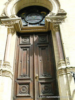
When brothers Peter and Francis Herter founded the architectural firm of Herter Brothers (not to be confused with the interior decorating and furniture firm of the same name), they had already been well established in their native Germany. Upon his arrival in New York in 1884 The New York Times called Peter “the richest builder on the banks of the Rhine.”
The Herters set about designing tenement buildings for the waves of immigrants settling on the Lower East Side. A major departure came when they were awarded the commission to design a grand synagogue at No. 12 Eldridge Street.
By the middle of the 1880s, thousands of poor Eastern European Jews were flocking to the neighborhood. The former Head Rabbi of St. Petersburg was one of the founders of the Congregation K’hal Adath Jeshuran and in 1886 he helped plan for a synagogue in which this new population could worship.
In addition to providing a house of worship, the leaders wanted to show the rest of the city that the oft-maligned Jews of the Lower East Side, too, could produce something monumental and beautiful; something in line with the new St. Patrick’s Cathedral or the imposing Gothic churches of Fifth Avenue.
Historians Henry Stolzman and Daniel Stolzman would later point out “The construction of the Eldridge Strreet Synagogue signaled – both to non-Jews, and to the German Jews who were embarrassed by the poverty and ‘Old World’ manner of the new immigrants—that Eastern European Jews, like their predecessors, could also thrive in America.”
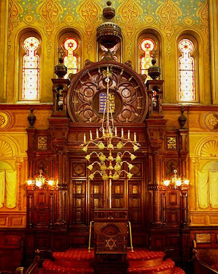
Opened just before the High Holy Days in 1887, the synagogue was a show-stopper. The Herters free-handedly melded Gothic, Moorish and Romanesque styles – four horseshoe-arched entrances were reflected by a gallery of similar windows directly above. A mammoth Gothic Rose window dominated the façade and a series of minaret-like towers rose above the roofline.
The highly-carved oak lecture is fitted with a brass handrail — photo eldridgestreet.org
Inside the space soared 70 feet upwards to colorful stenciled ceilings. The poor congregants, accustomed to dingy tenements and sweatshops, were surrounded by sumptuous brass lighting fixtures, 68 stained glass windows and carved wood. The velvet-lined ark, which could hold 24 Torah scrolls, was constructed in Italy from solid walnut and inlaid with mosaics.
The barrel-vaulted sanctuary with it brass main chandelier holding 75 bulbs — photo archpaper.com
The officers of the congregation established rules of decorum and ushers were appointed to enforce them. Upon signing the contract for the sale of seats, the congregants acknowledged that they “must adhere strickly to the rules for maintaining peace and order for the service.” Fines were levied for those interrupting the service by loud talking, late arrival, spitting on the floor and “unclean language.”
In order to enforce the spitting rule, dozens of spittoons were scattered about.
Eight months after its opening, the synagogue was the scene of an impressive memorial service for the German Emperor Frederick III. The temple was filled with mourners and the service was conducted in both English and German as Jews, decades away from the Holocaust, grieved the Emperor’s passing.
The synagogue was used not only as a place of worship, but it anchored the Jewish immigrant community – providing food for the poor, small financial loans, care for the sick, and information on finding employment or housing. Turn of the century Jews, however, were constantly faced with discrimination.
At a meeting in the synagogue on April 22, 1900 intended to protest immorality and vice in the neighborhood, visiting speaker Professor Adler said “I was talking with the Chief of Police recently and he whispered this in my ear: ‘Do you know who is responsible for the bad moral condition of the city? It’s just you Jews.’”
Through it all the Eldridge Street Synagogue thrived. On Rosh Hashanah and Yom Kippur it was necessary to post police on the street to control the throngs who flocked to the temple. By the 1920s the congregation was composed of over 300 families.
The vice and crime in the neighborhood’s that was so strongly derided by the congregation leaders in 1900 continued into the 20th Century. In 1930 thieves broke into the cellar of the synagogue, making off with antique relics and ceremonial silver items valued at over $2,000.
By the middle of the century, however, the synagogue fell on hard times. The Jewish population of the Lower East Side shrank as young members moved away to more affluent neighborhoods and the elderly died. By the late 1950s the beautiful sanctuary was sealed off and congregants conducted services in the basement.
The main synagogue sat unused for 24 years and, with no maintenance, the hand-stenciled walls and ceilings flaked and water seeped into the plaster. The degraded rear rose window was be replaced with glass blocks, rotting interior staircases were no longer safe to use, and pigeons roosted in the balconies.
The remarkable, restored trompe d oeil murals of cloth hangings can be seen on either side of the ark — photo eldridgestreet.org
The not-for-profit Eldridge Street Project was formed to save the structure. A non-sectarian group, it initiated a 20-year, $18.5 million restoration. With no vintage photographs to document what the rear rose window looked like, a design by Kiki Smith and architect Deborah Gans was chosen to replace the glass block patchwork. The designers drew on the star motif of the stenciled walls and ceilings to create an artwork of spiraling stars.
The replacement rose window by Kiki Smith and Deborah Gans — photo eldridgestreet.org
When it was re-opened in 2007, the Eldridge Street Synagogue began a new dual life as a house of worship and a museum. The Museum at Eldridge Street offers tours, concerts, lectures, and school programs.
The synagogue, now restored to its former glory, was added to the National Register of Historic Places in 1996.
VOTING IN RUSSIA I AM WORKING EARLY VOTING AND WILL BE BACK NEXT WEEK WITH THE DAILY WINNERS NAMES.
Text by Judith Berdy Thanks to Bobbie Slonevsky for her dedication to Blackwell’s Almanac and the RIHS Thanks to Deborah Dorff for maintaining our website Edited by Melanie Colter and Deborah Dorff All image are copyrighted (c)
A DAYTONIAN IN MANHATTAN
FUNDING PROVIDED BY ROOSEVELT ISLAND OPERATING CORPORATION PUBLIC PURPOSE GRANTS CITY COUNCIL REPRESENTATIVE BEN KALLOS DISCRETIONARY FUNDING THRU DYCD
ENTER ON SOUTH SIDE OF BUILDING ACROSS FROM GRADUATE HOTEL
THURSDAY 10 A.M. TO 8 P.M. FRIDAY 7 A.M. TO 4 P.M. SATURDAY 8 A.M. TO 5 P.M SUNDAY 8 A.M. TO 4 P.M.
IF YOU DO NOT VOTE THERE MAY NOT BE FUTURE EARLY VOTING ON ROOSEVELT ISLAND
THURSDAY, JUNE 17, 2021
The
392nd Edition
A STATUE OF LIBERTY
REPLICA IS COMING
FROM PARIS TO THE U.S.
from UNTAPPED NEW YORK
One of our favorite fun facts is that there are replicas of the Statue of Liberty in both New York City and in Paris. We’ve just gotten word that one of the replicas in Paris is making its way over to New York City for July 4th to be inaugurated on Ellis Island! It will then travel to Washington D.C. to be on display at the French Ambassador’s Residence for Bastille Day. The effort to bring “Lady Liberty’s Little Sister” to visit the U.S. is part of a 135th anniversary celebration of the Statue of Liberty crossing the Atlantic Ocean (in pieces) and is a partnership effort between the Embassy of France in the U.S., the Conservatoire national des arts et métiers (Cnam) and the CMA CGM Group, a shipping logistics company.
The original plaster sculpture, which sculptor Auguste Bartholdi made in his Paris studio, was bequeathed to the Musée des Arts et Métiers (Museum of Arts and Crafts) in the Marais district of Paris by his widow in 1907. In 2005, the French art dealer, Guillaume Duhamel, rediscovered the sculpture while accompanying his son’s elementary school class on a visit there. He convinced the museum to let him create 12 casts from the plaster original (the maximum allowed under French law) using the lost-wax method and the museum would get to keep the first cast. It’s been on display at the museum for the last decade.
The statue was taken down from the museum on June 7, 2021 and put into a plexiglass case custom-designed for the voyage. It will then be taken to the port city of Le Havre, where it will board the CMA CGM TOSCA on June 20th headed for New York in a branded shipping container.
According to a press release from the Embassy of France in the U.S., the Conservatoire national des arts et métiers (Cnam) and the CMA CGM Group, “The arrival of the new Lady Liberty will celebrate the most central value of the French-American partnership: freedom. The technological, artistic, and logistical challenges that had to be overcome to bring this new statue to America tell a modern tale of successful international cooperation.”
In celebration, the French Embassy will be hosting a contest on Instagram (@franceintheus) for participants to win LEGO® Architecture Statue of Liberty, a France-Amerique magazine subscription, an Albertine Books membership and more. Starting June 20th, the voyage of Statue of Liberty’s “Little Sister” can be viewed live on the CMA CGM website.
The statue is scheduled to arrive in New York by July 1st, when a ceremony will take place on Ellis Island to inaugurate the statue. It will be on display on the island until July 5th after which it will be transported to Washington D.C.. by CEVA Logistics.
You can also see this statue with your tickets to our tour of the abandoned hospitals of Ellis Island, with tickets still available for the July 3 and 4:
DUE TO THE FACT THAT I AM WORKING CRAZY HOURS I CANNOT LIST THE WINNERS DAILY!! AFTER THE ELECTION THE WINNERS WILL BE POSTED
Text by Judith Berdy Thanks to Bobbie Slonevsky for her dedication to Blackwell’s Almanac and the RIHS Thanks to Deborah Dorff for maintaining our website Edited by Melanie Colter and Deborah Dorff All image are copyrighted (c)
Sources UNTAPPED NEW YORK (C)
FUNDING PROVIDED BY ROOSEVELT ISLAND OPERATING CORPORATION PUBLIC PURPOSE GRANTS CITY COUNCIL REPRESENTATIVE BEN KALLOS DISCRETIONARY FUNDING THRU DYCD
Countless people have lived and many have died on our Island. But how about a notorious Nazi spy? There’s a thriller. So lean back and enjoy a tale of spies, espionage, a femme fatale, a hero and the FBI, a tale that ends on our Island – the story of Frederick “Fritz” Joubert Duquesne.
The Duquesne Spy Ring is the largest espionage case in the United States history that ended in convictions. The German agents who made up the Duquesne Ring were placed in key jobs in the United States to get information that could be used in the event of war and to carry out acts of sabotage. After a lengthy investigation by the FBI, 14 members of a German espionage network headed by Duquesne were convicted (19 others had pleaded guilty) on December 13, 1941, just days after Germany declared war on the US.
The Spy Leader: Frederick “Fritz” Joubert Duquesne (1877–1956) was a South African Boer and German soldier, big-game hunter, journalist, and spy.
Captain Frederick Duquesne ca 1900 https://roughdiplomacy.com/convicted-members-of-duquesne-spy-ring/
Duquesne fought for the Boers in the Second Boer War and was a German secret agent during both World Wars. He led spy rings and carried out sabotage missions in South Africa, Great Britain, Central and South America, and the United States. He went by many aliases, fictionalized his identity and background on multiple occasions, and operated as a con man. He was also adviser on big game hunting to President Theodore Roosevelt, a publicist in the movie business, a journalist, a fictional Australian war hero, and head of the New Food Society in New York.
After a half century of this speckled career, in spring 1934, Duquesne became an intelligence officer for the Order of 76, an American pro-Nazi organization. Admiral Wilhelm Canaris, head of Germany’s military intelligence, knew Duquesne from WW I, and instructed his new chief of U.S. operations, Col. Nikolaus Ritter, to contact him. Ritter had been friends with Duquesne and the two spies reconnected in New York in December 1937. Ritter employed several other successful agents across the US, most notably Herman Lang, who delivered blueprints for the highly secret Norden bombsight. He also recruited William Sebold and sent him to New York to set up a shortwave radio-transmitting station to establish contact with the German shortwave station abroad. Sebold was instructed to use the code name TRAMP and to contact a fellow agent, Fritz Duquesne. Dequesne soon headed a large spy network in the US. Its job was to find holes in American military forces and preparedness before the US entered the war and to find ways to destabilize the country and its morale. The information that members of the ring passed forward supported acts of domestic terrorism and sabotage as well as industrial and military espionage. Working from a phony business office at 120 Wall St., methods were often crude but effective: Duquesne would contact defense companies such as Grumman Aircraft Engineering, requesting photos and plans of its developing technology for “lectures” he was giving. Astonishingly, the material would be sent with “warm regards.” From his hands, it would pass to Nazi eyes. One of his agents opened a restaurant and used his position to get information from his customers; another worked on an airline so that he could report Allied ships that were crossing the Atlantic Ocean; others worked as delivery people as a cover for carrying secret messages.
Duquesne’s luck finally ran out in 1941 when he was arrested by the FBI as the leader of the biggest spy network in US history after extensive surveillance of his group’s activities. On June 28, 250 agents pulled spies from ships, bars and beds. Of the 33 charged, 16 pleaded guilty, while the others went to trial and were convicted. Duquesne and Lang got hit hardest, with 18-year sentences each. The Hero: William G. Sebold, who had been blackmailed into becoming a spy for Germany, became a double agent and helped the FBI gather evidence.
Agent William Sebold (pictured with his wife Ellen). (Courtesy of Camerer)
Sebold, a German immigrant, was a naturalized American citizen when he returned to Germany to visit his mother in 1939. The Nazis, impressed with a low-level job Sebold once held in the aircraft industry, were determined to put a spymaster in place in Manhattan. Nikolaus Ritter needed a man in place to receive contraband documents and to pass along information gleaned by fifth column spies floating around Manhattan beer halls and docks. Sebold was coerced into the position — but before he even left Germany, he contacted the US Consulate in Cologne, informing it of the traitorous role he was being forced to assume. FBI agents met Sebold when his ship, the Washington, docked at Pier 59 on Feb. 8, 1940, and escorted him to headquarters.
There he repeated his incredible tale of being trained as a spymaster and provided the names of spies already at work. His story was relayed directly to FBI Director J. Edgar Hoover, who in turn informed President Franklin D. Roosevelt.
For nearly two years, the FBI ran a shortwave radio station in New York for the ring. They learned what information Germany was sending its spies in the US and controlled what was sent to Germany. After Sebold set up his own dummy office in Times Square, he stumbled on another ring operating out of New York. Two spies, a butcher and baker employed by the cruise ship Manhattan, functioned as couriers between Berlin and New York. Another confederate, Paul Fehse, was in charge of the marine division. He and an associate who worked the Brooklyn boat basin wandered the docks picking up information on shipping movements to feed U-boats their targets. (A recent book by Rhodri Jeffreys-Jones, THE NAZI SPY RING IN AMERICA, Hitler’s Agents, the FBI, and the Case That Stirred the Nation, Georgetown University Press, 2020, looks in depth at all of this.) I promised you a femme fatale: Enter Lilly Stein.
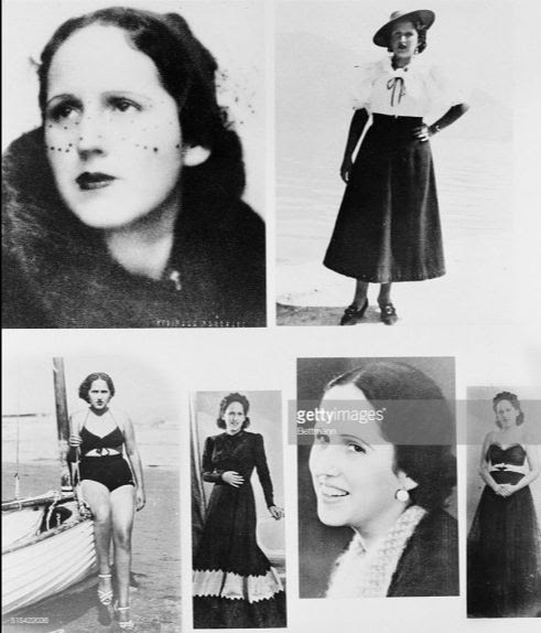
A beautiful young Austrian, a Jewish immigrant, Lilly in the early 1930s decided like so many other starving young European women to become a prostitute. But Lilly became a “high-class” whore and set her sights on bigwigs across Europe. Soon she was wealthy herself, entertaining men from Austria to Paris. Then one day in 1938 she was contacted by the Gestapo and drafted into service. Now Lilly would be a spy for them, acting as a courier. But Lilly always struggled to be the best and threw herself into spycraft, eventually becoming a capable spy herself – in the bedroom. The head of FBI operations in New York worried that Sebold had “an honesty complex” that might botch things up, but he proved immensely skilled and unflinching in the field — particularly when he came up against femme fatale Lilly Stein, who tried to seduce him. Always sexually ready — one FBI agent described her as a “good-looking nymphomaniac” — her job was to prowl nightclubs looking for men who would pillow-talk about war developments or deals in industry and finance. She made “advances” on Sebold during one of their late-night meetings, though he refused. When she was arrested with the rest of the gang, it was said that she propositioned a federal agent.
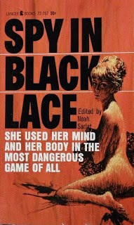
Lace, edited by Noah Sarlat, 1964, Lancer Books. The first chapter tells Lilly Stein’s story. Photos of Lilly Stein, https://roughdiplomacy.com/convicted-members-of-duquesne-spy-ring/
The end
The 64-year-old Duquesne did not escape this time. He was sentenced to 18 years in prison, with a 2-year concurrent sentence and $2,000 fine for violation of the Foreign Agents Registration Act. He began his sentence in Leavenworth Federal Penitentiary in Kansas, along with Hermann Lang. In 1945, Duquesne was transferred to the Medical Center for Federal Prisoners in Springfield, Missouri, due to his failing physical and mental health. In 1954, he was released owing to ill health, having served 14 years. His last known lecture was in 1954 at the Adventurers’ Club of New York, titled “My Life – in and out of Prison”.
Stein went to prison for 12 years. When last heard from, she was working at a luxury resort near Strasbourg, France.
Sebold’s own end was much sadder. He entered an early version of the witness protection program, moving to California and taking work at the Benicia Arsenal. But ill health plagued him, and he had trouble keeping a job. For a time he tried to make a go of it as a chicken farmer. Then paranoia set in — and it wasn’t entirely unfounded. From time to time he would receive word from family back in Germany that Nazis still had him in their sites for reprisal. Impoverished and delusional, he was committed to Napa State Hospital in 1965. Diagnosed with manic-depression, he died there of a heart attack five years later at 70.
Oh yes, Welfare Island. Fritz Duquesne died at City Hospital on Welfare Island, in New York City on 24 May 1956 at the age of 78 years. OK, just one spy. If I’ve misled you, apologies. But he did die here. And it was a pretty good story.
FUNDING PROVIDED BY ROOSEVELT ISLAND OPERATING CORPORATION PUBLIC PURPOSE GRANTS CITY COUNCIL REPRESENTATIVE BEN KALLOS DISCRETIONARY FUNDING THRU DYCD
ENTER ON SOUTH SIDE OF BUILDING ACROSS FROM GRADUATE HOTEL
TUESDAY, WEDNESDAY,THURSDAY 10 A.M. TO 8 P.M. FRIDAY 7 A.M. TO 4 P.M. SATURDAY 8 A.M. TO 5 P.M SUNDAY 8 A.M. TO 4 P.M.
IF YOU DO NOT VOTE THERE MAY NOT BE FUTURE EARLY VOTING ON
ROOSEVELT ISLAND.
TUESDAY, JUNE 15, 2021
The
390th Edition
From the Archives
MABEL PUGH ARTIST
FROM THE SMITHSONIAN AMERICAN ART MUSEUM
Mabel Pugh, Twilight Snow, n.d., linoleum cut on paper, Smithsonian American Art Museum, Transfer from the North Carolina Museum of Art (Gift of the artist, 1977), 2020.4.5
Mabel Pugh (1891-1986)
FROM GALLERY C, RALEIGH, NC
Mabel Pugh was a native of Morrisville, North Carolina. Mrs. Ruth Huntington Moore encouraged Pugh to study art at Peace Junior College in Raleigh. Mable Pugh went on to study at the Art Students’ League in New York, then in Philadelphia at the Pennsylvania Academy of Fine Arts. Mabel Pugh won the Cresson Traveling Scholarship in 1919 while at the Academy. This was her first opportunity to travel and sketch in Europe and she was there for four months.
When she returned from Europe, Pugh settled in New York. She began to work as a professional artist. Success followed soon. Her block prints began appearing on the covers of popular novels. Her illustrations were published in those same books. Then her paintings started to receive recognition at exhibitions. Publishers quickly recognized Mabel Pugh’s talent. Her illustrations were used in many magazines such as McCall’s, Ladies’ Home Journal, The Forum and The Survey Graphic. The artist won numerous exhibition awards at various venues including the Pennsylvania Academy of Fine Arts in 1920, the National Association of Women Painters and Sculptors in 1934. Mabel Pugh’s painting “My Mother” was included in the first New York World’s Fair. She wrote and illustrated “Little Carolina Bluebonnet” which was first published in 1933 by Crowell.
In 1926 Pugh exhibited a series of wood block prints in the International Print Makers Exhibition at Los Angeles. This series, done from sketches she made in Europe, received accolades from as far away as Australia. The director of the Museum of Fine Arts in Houston, Texas, purchased a piece and later hosted an exhibit of the artist’s prints at that museum. In 1931 the artist was recognized as a charter member of the North Carolina Association of Professional Artists, though already well established in New York City as a printmaker, painter and illustrator.
When her original art instructor Mrs. Moore passed away, Peace College in Raleigh asked Mabel to return and become head of the Art Department; she accepted the offer and moved back to her hometown of Morrisville in 1938. Pugh continued to publish her illustrations and retired from Peace College in 1960, so she could devote all of her energy to her creative endeavors.
Mabel Pugh, Laundry Workers, ca. 1936-1960, monoprint, Smithsonian American Art Museum, Transfer from the North Carolina Museum of Art (Gift of the artist, 1977), 2020.4.2
Mabel Pugh, At the Tubs, ca. 1936-1960, lithograph, Smithsonian American Art Museum, Transfer from the North Carolina Museum of Art (Gift of the artist, 1977), 2020.4.1
Mabel Pugh, Little Church Around the Corner, ca. 1926-1936, linoleum cut on paper, Smithsonian American Art Museum, Gift of Martin Diamond, 1992.110
Mabel Pugh, John Curry and Peter Newell, 1954, lithograph, Smithsonian American Art Museum, Transfer from the North Carolina Museum of Art (Gift of the artist, 1977), 2020.4.6
Portrait in Red and Black Silk Dress, oil on canvas, 26 x 19 inches Gallery C, Raleigh, NC
Portrait of Ellen Stone Scott, oil on canvas, 1926, 36 x 40 inches
ALEXIS VILLEFANE GUESSED THE STICKER LEADING TO THE EARLY VOTING POLL SITE AT SPORTSPARK
Text by Judith Berdy Thanks to Bobbie Slonevsky for her dedication to Blackwell’s Almanac and the RIHS Thanks to Deborah Dorff for maintaining our website Edited by Melanie Colter and Deborah Dorff Sources
SMITHSONIAN AMERICAN ART MUSEUM
FUNDING PROVIDED BY ROOSEVELT ISLAND OPERATING CORPORATION PUBLIC PURPOSE GRANTS CITY COUNCIL REPRESENTATIVE BEN KALLOS DISCRETIONARY FUNDING THRU DYCD
I’m often asked what my favorite weird/obscure fact about New York City was. Ironically, as the founder of Untapped New York, this question frequently proves difficult because there are just so many amazing things about this city. So I went back into my memory archives, thinking what about New York City impelled me to create Untapped New York. The pneumatic tube mail system is top on that list.
The first pneumatic tube mail system was installed in Philadelphia (sorry New York) in 1893. New York City’s came in 1897. Each tube could carry between 400 and 600 letters and traveled at 30-35 miles per hour. In its full glory, the pneumatic tubes covered a 27-mile route, connecting 23 post offices. This network stretched up Manhattan’s east and west sides, from Bowling Green and Wall Street, all the way north to Manhattanville and East Harlem.
Anecdotal stories indicate that the system may have extended into the Bronx, with sandwich subs reportedly being delivered via pneumatic tubes from a renown subway shop in the Bronx to downtown postal stations. Maps at the National Postal Museum show proposed extensions to the Bronx and other areas within Manhattan, many which were never completed. The system even crossed boroughs into Brooklyn (using the Brooklyn Bridge), taking four minutes to take letters from Church Street near City Hall to the General Post Office in Brooklyn (now Cadman Plaza).
The system, which was located 4 to 6 feet below the city streets, was created and owned by private companies, to which the city paid rent and labor. According to The Smithsonian National Postal Museum, “Installation of the tubes was problematic, with previously laid pipes for sewage and gas limiting the size and thus the amount and kind of mail a pneumatic tube could carry. Water table levels also presented difficulties. Later, the New York City system was purchased and operated by the U.S. Postal Service. Using power from old-school electric motors, made by the likes of General Electric and Westinghouse, air pressure was created by rotary blowers and air compressors. Each canister was labeled on the outside with its destination, but all the tubes had to come out at each station. So if a canister was destined for another station, it would be sent back again into the tubes and on its way.
To feed my growing obsession with pneumatic mail, I went to Washington D.C.’s Smithsonian National Postal Museum where I met with Manda Kowalczyk an Accessions Officer at the Museum. She pulled all the items in the Postal Museum that are connected to the pneumatic tube mail systems in America. One of them you can see on a regular visit to the museum is the pneumatic tube mail canister which is on exhibit. This 24 inch long, 8 inch wide metal canister could carry somewhere between 400 and 600 letters. And, it could have definitely fit a small black cat.
Pneumatic Tube Mail system map of New York City from November 1937. Photo courtesy National Postal Museum, Smithsonian Institution
The Postal Museum also has several maps of the New York City pneumatic tube system, mostly from the 1930s and 40s. A 1947 map has some fun facts, including the time it took to send mail between the General Post Office and other stations, the number of canisters that went through the system daily (95,000), the pressure needed (3 to 8 lbs per inch), and the speed (5 tube carriers per minute and 30 mph). That year there were 26.969 miles of 2 way pneumatic tubes tubes. It even has the hours of operation: Weekdays from 5 AM to 10 PM, Saturday from 5 AM to 10 AM, and no service on Sundays and legal holidays. I love the thought of mail getting shot underground at 5 AM to arrive just time for the beginning of the work day.
A message you’d get from the Postmaster if your mail was damaged in the pneumatic tube. Photo courtesy National Postal Museum, Smithsonian Institution According to Kate Ascher, author of The Works, “The high operating costs of the pneumatic system ultimately proved its downfall. By 1918, the federal government considered the annual rental payments ($17,000 per mile per annum) made by the post office to be ‘exorbitant’ and endorsed a new alternative with greater capacity–the automobile–as the delivery method of choice.” In New York City, a successful lobby by contractors led to the reinstatement of pneumatic mail service in 1922. A complete stop didn’t happen until 1953. Paris’ system, which covered 269 miles, continued for an additional 34 years (but was more limited in what it could carry–the pipes were only 2 inches diameter).
Pneumatic tube mail remnants inside the Old Chelsea Post Office And what’s left of the pneumatic tubes? Not much, if at all. The location of the tubes within a city’s underbelly basically guaranteed its destruction once no longer in use. The only known remaining remnant of the pneumatic tube mail system is in the Old Chelsea Post Office at 217 W 18th Street, where tubes come through a wall in the basement. They sit at the end of a forgotten brick-lined hallway filled with office supplies. Kate Ascher also notes that there was a time when remnants of the pneumatic tubes were still being found, but not often any longer. Some additional fun facts about the pneumatic tube mail system: According to this incredible article by Robert A. Cohen, the first cylinder tube to travel through the New York City system contained “a Bible, a flag and a copy of the Constitution. The second contained an imitation peach in honor of Senator Chauncy Depew (He was fondly known as “The Peach”). A third carrier had a black cat in it, for reasons unknown.” It had set hours of operation: 5am to 10pm on weekdays, and 5am to 10am on Saturdays The size of the carriers in New York City was 24 inches long, 8 inches across 95,000 letters were moved daily, about 1/3 of all first class letters It took 4 minutes to get from the General Post Office (now Moynihan Train Hall) to Grand Central using a tranverse tube that cut across Manhattan It took between 15 and 20 minutes for mail to get from Herald Square to Manhattanville and East Harlem It took 11 minutes to get from the General Post Office to the Planetarium Post Office, near the Museum of Natural History
PHOTO OF THE WEEK
EARLY VOTING ON ROOSEVELT ISLAND AT SPORTSPARKS VOTE TODAY FROM 7 A.M. TO 4 P.M. (I WILL BE THERE TO GREET OUR LOYAL READERS!)
VINTAGE MAP OF NEW YORK ED LITCHER GOT IT!WE ARE WORKING EARLY VOTING SO WE WILL BE A LITTLE DISCOMBOBULATED THIS WEEK!
Text by Judith Berdy Thanks to Bobbie Slonevsky for her dedication to Blackwell’s Almanac and the RIHS Thanks to Deborah Dorff for maintaining our website Edited by Deborah Dorff All image are copyrighted (c)
UNTAPPED NEW YORK
FUNDING PROVIDED BY ROOSEVELT ISLAND OPERATING CORPORATION PUBLIC PURPOSE GRANTS CITY COUNCIL REPRESENTATIVE BEN KALLOS DISCRETIONARY FUNDING THRU DYCD
Georgette Sinclair’s art training started in her childhood when she attended the Public School of Art in Romania where she took drawing and painting classes.
After Ms. Sinclair immigrated to the United States, she started a new life as an American citizen while attending school at night. She obtained a Master of Science and a Doctoral degree in Audiology, which adds to her Master degree in Special Psychology and Pedagogy already earned back in Romania from Cluj-Napoca University.
In New York, she attended the Art Student League of NYC, studying under Richard Pionk and John Foote, in addition to attending workshops at Woodstock School of Art and the Hudson River Valley Art School. She also studied with master pastelist, Elizabeth Mowry, at various workshops in France in the Artist’s Retreat Program.
Ms. Sinclair works mostly in pastels and oils and is fascinated by the beauty of nature. She finds poetry in ordinary scenes and her landscapes express a mood and speak to everyone by freezing a moment before it is gone forever. In her vision, expression of mood is the response to a fragment in time. She delights in painting outdoors but is also fascinated by peeking in and out of the windows which are the subject of some of her paintings. She travels extensively and her trips, a great source of inspiration, have a big impact on her work.
Ms. Sinclair has been a member of the Salmagundi Club and Pen & Brush, Inc, NYC since 2001 and RIVAA (Roosevelt Island Visual Art Association, NYC) since 2000.
I am working early voting this week, so forgive me if I miss some names. KATZ, ED LITCHER, MITCH HAMMER GOT IT
Text by Judith Berdy Thanks to Bobbie Slonevsky for her dedication to Blackwell’s Almanac and the RIHS Thanks to Deborah Dorff for maintaining our website Edited by Deborah Dorff Roosevelt Island Historical Society
GEORGETTE SINCLAIR
Text by Judith Berdy Thanks to Bobbie Slonevsky for her dedication to Blackwell’s Almanac and the RIHS Thanks to Deborah Dorff for maintaining our website Edited by Melanie Colter and Deborah Dorff
All image are copyrighted (c) Roosevelt Island Historical Society unless otherwise indicated
FUNDING PROVIDED BY ROOSEVELT ISLAND OPERATING CORPORATION PUBLIC PURPOSE GRANTS CITY COUNCIL REPRESENTATIVE BEN KALLOS DISCRETIONARY FUNDING THRU DYCD