The first Jewish congregation in the United States, Shearith Israel, was established in Lower Manhattan in 1654 by 23 Sephardic Jews who fled Brazil when it was conquered by the Portuguese (who demanded that Jews convert to Christianity). The new graphic novel “Remnants,” by Julian Voloj, details the story.
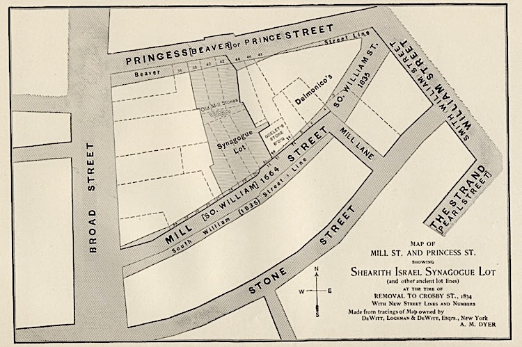
This fledgling Jewish community eventually consecrated the Mill Street Synagogue, located on what is now South William Street. They called their new temple “Shearith Israel,” which translates literally as, “remnant of Israel.” It was the first Jewish house of worship in North America. Although that pioneering temple has long since vanished, the Shearith Israel congregation endures, and is now headquartered at Central Park West and 70th Street.
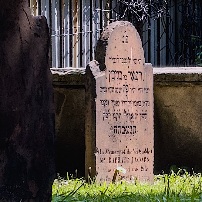
In Lower Manhattan, a different remnant remains: the Chatham Square Cemetery. In 1682, Shearith Israel built this cemetery, which still occupies its original site at 55 St. James Place (near Worth Street). It was a serendipitous walk by this burying ground—the second oldest in Manhattan, behind only that of Trinity Church—that inspired Mr. Voloj to write “Remnants.”
Mr. Voloj (who collaborated with artist Ardre Diniz on “Remnants”) grew up in Germany with two Colombian parents. He became a photographer, and, in New York, worked on a series on Jewish diversity. “I grew up in a small Jewish community in my hometown,” he said. “Coming to America was so different. I grew up in a minority, the last remnant of a once thriving culture. I came to New York in the early 2000s, when there was lots going on with exploring Jewish identity. I realized when people think of Jewish identity, they think of classic Ashkenazi identity,” a reference to Jews originating in Central and Eastern Europe, “but there’s so much more to Jewish identity.”
America’s first Jews were Sephardic (meaning they were descended from the Jewish community on the Iberian Peninsula), he noted. “Their ancestors were persecuted in Portugal and they created the first synagogue in Brazil, but had to flee when the Portuguese recaptured Brazil. For a long time, American Jewry was Sephardic, not Ashkenazi.”
This map from 1900 shows the location of the Mill Street Synagogue by superimposing tracings of earlier maps from the 1700s and 1800s with what was then a contemporary street grid.
“The story of the 23 Jews is the origin of American Jewry,” he continued. “It’s an amazing story that they came in 1654. For American Jews, America was the promised land. For many years, Jews were excluded from industries and they created their own. This is how the comic book industry was created. The story also shows how everything changes—there were Sephardic Jews from 1654 onwards, then the German Jews who came after the failed revolution of 1848, then Eastern Europeans, then Holocaust survivors, then Syrians and Ethiopians. Today it is much more diverse because many different groups have come and it shows how identity always changes.”
Reflecting on the community that immigrants find in America and how his research for ‘Remnants’ has shaped his perspective, Mr. Voloj said, “I am an immigrant myself. I didn’t have the struggles other had coming here, but I was born to Colombian immigrants and saw that my dad, who was not able to learn the language perfectly in his lifetime, was discriminated against. I feel sympathetic to the struggle of immigrants. The landscape is becoming more xenophobic and anti-immigrant. ‘Remnants’ is an important tale, mainly directed towards younger readers but still a universal tale, of what it means to become an American.”
The author also believes the graphic novel form is uniquely suited for making history accessible to new generations of readers. “The general attention span is going down because we are on our mobile phones,” he said. “Graphic novels are a nice middle way, because it’s a book form, but it allows you to package complex topics.”
Mr. Voloj’s next project will recount the story of Julius Hirsch, the first Jewish player on Germany’s national soccer team. “In the 1910s, he was a huge star,” the author said. “He assumed that because he was such a beloved star, the Nazis would not kill him, so he ended up not fleeing and he was murdered in Auschwitz.” Produced in partnership with the German Soccer Federation, the new graphic novel was previewed on July 7 at the German House of Soccer, a pop-up fan zone in Chelsea, as part of New York’s World Cup festivities.
Grace Glukhov
PHOTO OF THE DAY
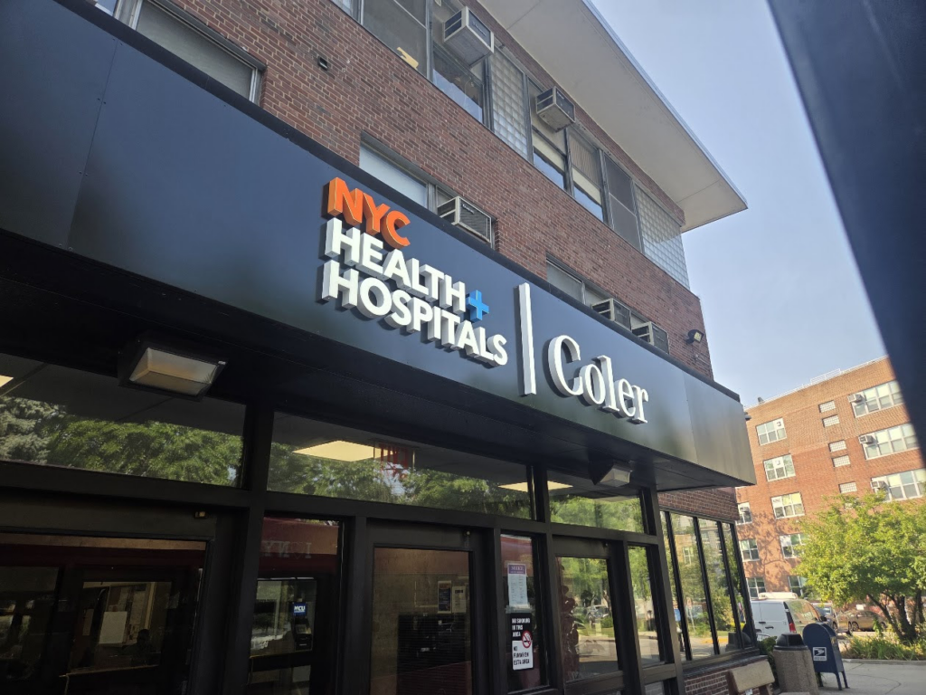
A BRIGHT NEW SIGN FOR COLER
CREDITS
The Broadsheet “Lower Manhattan’s Local Newspaper”
All image are copyrighted (c) Roosevelt Island Historical Society unless otherwise indicated THIS PUBLICATION FUNDED BY DISCRETIONARY FUNDS FROM CITY COUNCIL MEMBER JULIE MENIN & ROOSEVELT ISLAND OPERATING CORPORATION PUBLIC PURPOSE FUNDS.
The Forgotten Black Nurses Who Helped Cure Tuberculosis in NYC
Untapped New York
Tuesday, July 14, 2026
Issue # 1713
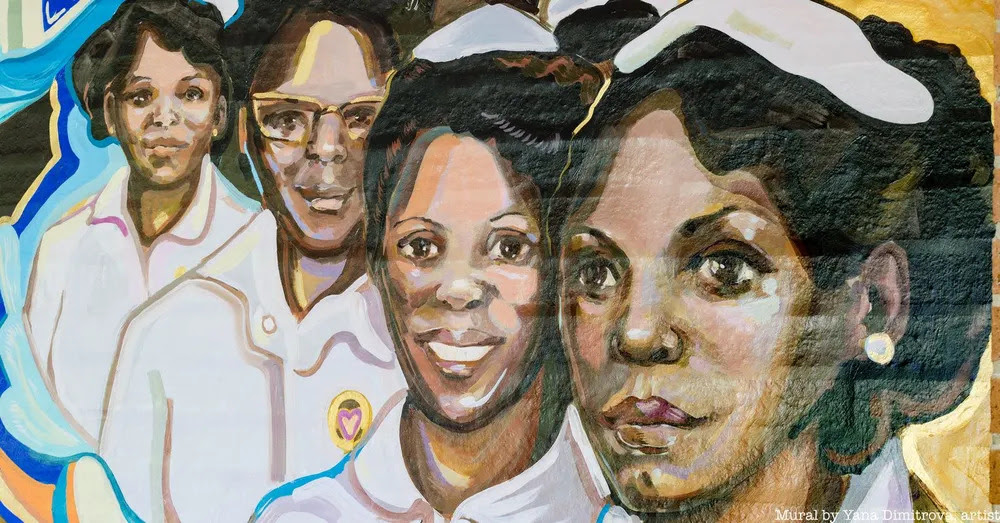
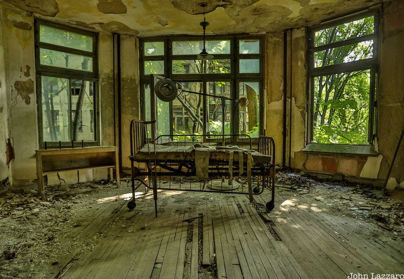
In 1929, Sea View Hospital was in crisis. The now-partially abandoned Staten Island medical facility was experiencing a mass exodus of white nurses while simultaneously handling an overwhelming amount of tuberculosis patients. To remedy the situation, New York City officials began recruiting Black female nurses from the South, offering freedom from the oppression of Jim Crow and the benefits of good pay, education, housing, and employment. The stories of these trailblazing nurses have gone largely untold for nearly a century, but now, author Maria Smilios sheds light on their achievements in her new book TheBlack Angels: The Untold Story ofthe Nurses Who Helped Cure Tuberculosis.
In the early half of the 20th century, tuberculosis killed over 5.6 million Americans. The disease was especially devastating to cities like New York, where it ran rampant through crowded tenement houses and spread rapidly among poor communities. Those suffering from the disease were sent to various healthcare facilities around the edge of the city in hopes of containing the spread and giving patients clean, fresh air.
Sea View Hospital opened in 1913 and was comprised of thirty-seven buildings. The sprawling complex sat at the second-highest point on Staten Island, once the site of a grand hilltop estate called “Ocean View.” By the 1920s, when the 2,000-bed hospital was running out of nurses, it was called a “pest house” and a place where “no one left alive.” The Black Angels changed that.
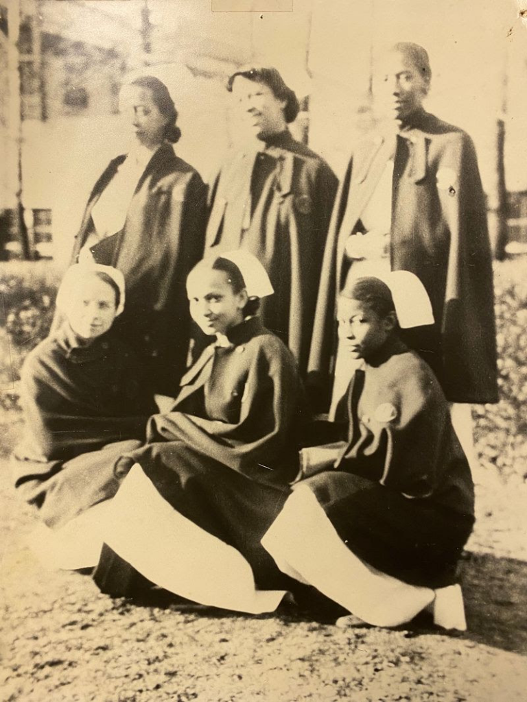
Over the course of twenty years, women like Edna Sutton, Missouria Louvinia Meadows-Walker, Clemmie Philips, Janie Shirley, and Virginia Allen, bravely marched to the front lines of the epidemic and cared for patients who others turned their backs on. Not only did these women work grueling hours day in and day out and put themselves at risk to care for New York’s sick, but they did so while also fighting racism and discrimination.
Photo Courtesy of NYCHHC Sea View Archives
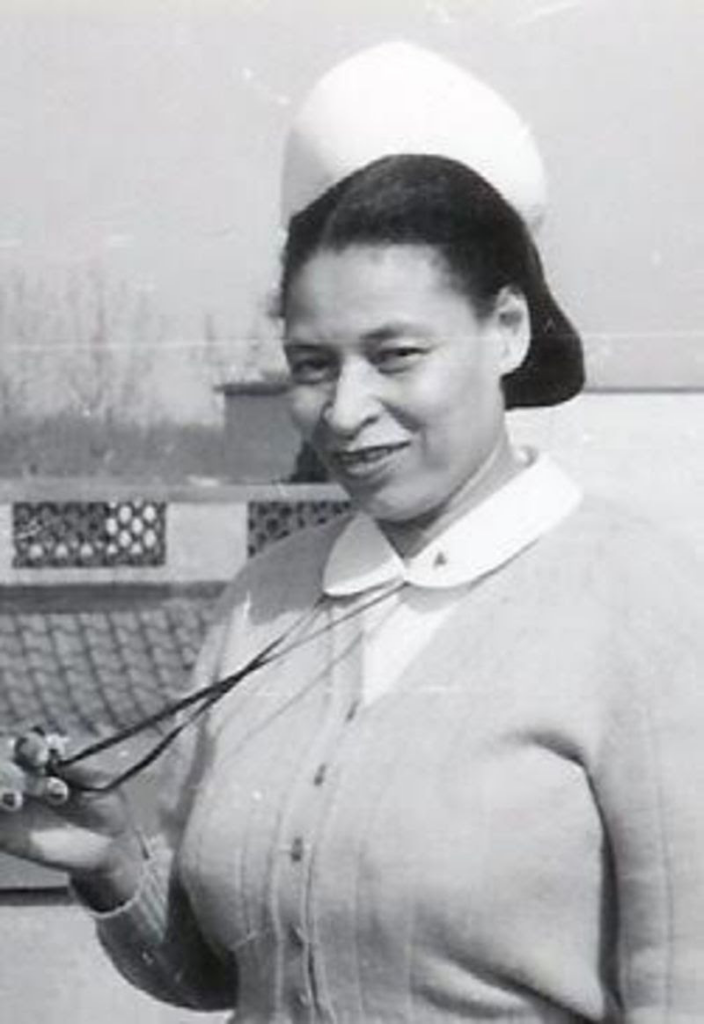
At the time, most of New York City’s more than two dozen municipal hospitals discriminated against Black nurses in some way, whether that meant they simply were not allowed to be hired or there were quotas that limited the number of Black nurses who could be employed. While the medical breakthroughs of white, male doctors and researchers at Sea View who found a cure for tuberculosis have long been celebrated worldwide, the contributions of the Black nurses – who were among the first to administer the groundbreaking drug, isoniazid – have largely been kept alive in the memories of their families, friends, and local communities.
Photo Courtesy of James Williams
Using first-hand interviews and never-before-accessed archives, Smilios brings the stories of the Black Angels to center stage, highlighting how their efforts helped to desegregate the New York City hospital system, stop discriminatory practices in medical education and medical research, and ultimately save countless lives. Learn more about The Black Angelsfrom the author in our virtual talk, and get your own copy of The Black Angels, out now!
PHOTO OF THE DAY
ENJOYING A SHOWER AT BLACKWELL PARK
CREDITS
UNTAPPED NEW YORK
This post contains affiliate links, which means Untapped New York earns a commission. There is no extra cost to you and the commissions earned help support our mission of independent journalism!
All image are copyrighted (c) Roosevelt Island Historical Society unless otherwise indicated THIS PUBLICATION FUNDED BY DISCRETIONARY FUNDS FROM CITY COUNCIL MEMBER JULIE MENIN & ROOSEVELT ISLAND OPERATING CORPORATION PUBLIC PURPOSE FUNDS.
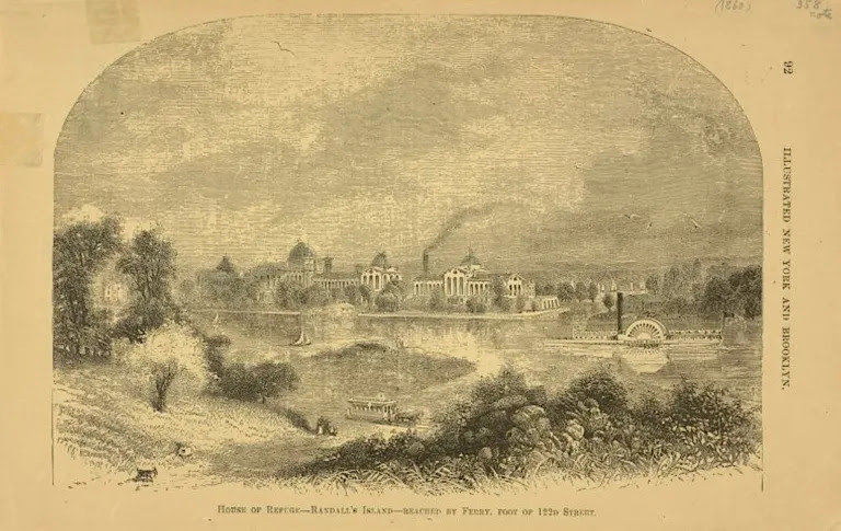
If you were a New Yorker in the 19th century and found yourself to be poor, incurably sick, homeless, or convicted of a crime, you might have been herded into a ferry and confined to one of the “islands of the undesirables” in the East River.
In the colonial era, these islands were privately owned spits of land used for farming, foraging, or as pasture for grazing animals. Throughout the 19th century, many became city property.
In the eyes of officials at the Department of Public Charities and Correction, these islands were ideal places to house—some would say warehouse—adults and children who were deemed to require specialized care or oversight.
Blackwell’s Island, today’s Roosevelt Island, was the island with the largest population, thanks to its infamous “Lunatic Asylum” as well as a penitentiary, almshouse, smallpox hospital, and other facilities.
North Brother Island was home to a quarantine hospital for people with incurable yet contagious diseases like typhoid and tuberculosis. (Typhoid Mary was forced to spend the last three decades of her life here.)
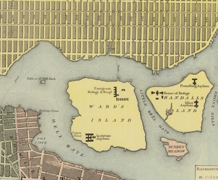
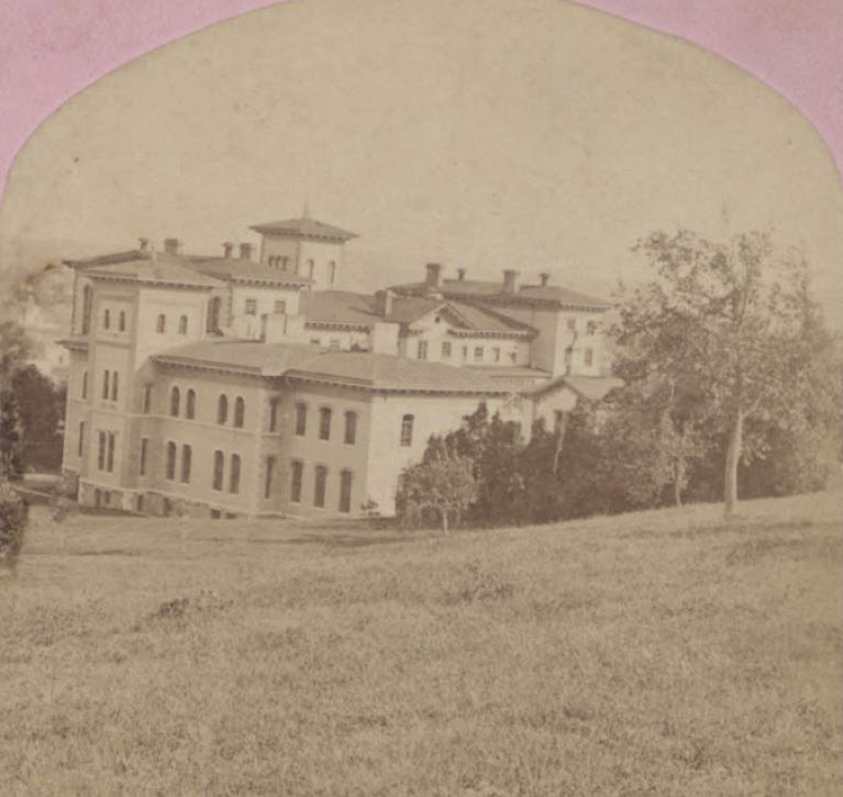
Randalls Island, meanwhile, hosted the House of Refuge for juvenile offenders, the Foundling Hospital that cared for the many babies abandoned in alleys and ash barrels, and an infamous facility known as the “Idiot Asylum.”
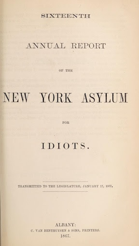
The story of the Idiot Asylum—”idiot” being the medical definition at the time for someone with an intellectual disability—has often been overshadowed by reports of the decrepit conditions of the Lunatic Asylum and Almshouse.
But one unnamed reporter at the New-York Tribune decided to pay the Idiot Asylum a visit. His writeup wasn’t the first telling of what life was like in “the walls of the forlorn houses,” as he put it.
With the stark title “An Island Full of Idiots,” however, and published on New Year’s Day in 1888, it might be the most affecting. His account is sad, strange, and heartbreaking.
“From the great cozy city, full of inspiring life, you are rowed across the East River to this desolation by a little, old, silent boatman,” the reporter wrote as he began his journey. “Then, as your feet crunch the frozen snow, you are aware of an oppressive loneliness.”
“And yet you are not alone. A sound of rhythmical scraping attracts your gaze, and it falls on a gang of men shoveling snow.”
“They are dressed alike in clothes striped with black and white. They exchange no words. A man in official uniform sharply watches their compulsory toil. Looking at them you feel lonelier than ever.”
The reporter goes on to describe the residents he sees inside as “members of the irresponsible classes” and “imbecile men and women, boys and girls, who would otherwise desolately drift through life to a miserable death.”
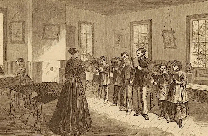
The Idiot Asylum featured a school. The staff taught higher-functioning residents to read, write, and “do a little figuring, so well as to warrant their return to the outside world, in which they will make better members of society than a good many folks who have, and others who think they have, all their wits about them.”
Others were taught simple skills like making mats. “Many of the teachable class make a progress toward intelligent usefulness which is astonishing and speaks volumes for the patient, unwearying care and skill of their instructors.”
Through a doorway he sees a group of residents singing and exercising. “The song shapes itself into a rough outline of some popular air. In a big bare room over a score of eccentric specimens of humanity are stomping around in an endless march.”
As he walks through the asylum, he encounters female residents. “Women in mature life join hands to play ‘Jingo-Ring’ and sing “Little Sally Waters’ with the glee of schoolgirls.”
Some of the residents he describes sound more like they fit the definition of autism, which was not yet an official diagnosis.
“There is also a large number of the women, as well as a few of the men, in whom an idiosyncracy, greatly developed, constitutes their mental weakness. Watch a group of them together, and you will see each oblivious to the others.”
“Some rock themselves to and fro all day long. One rather pretty girl constantly brushes her long hair back from her brow. Some repeat snatches of merry tunes with no mirth in them. Some are over overwhelmingly vain, other overwhelmed in melancholy.” How the 1888 article was received isn’t known. But four decades later, the Idiot Asylum was closed and demolished, along with Randalls Island’s other 19th century institutions. (The Manhattan Psychiatric Center, a hospital built in the 1950s, remains.) Oversight of the island was transferred to NYC Parks in 1933 under the supervision of Robert Moses. In the ensuing decades, the island became a recreational space with ballfields and a sports stadium, now know as Icahn stadium.
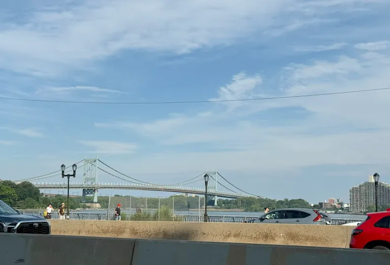
In the 1960s, the channel separating Randalls and Wards Islands was filled in. Now, Randalls and Wards Island constitutes one land mass reachable by the Triborough (Robert F. Kennedy) Bridge and a footbridge at 103rd Street.
Newspaper reporters in the Gilded Age visited and wrote what they saw. But I wonder if any of the inmates at the Idiot Asylum ever recorded the details of their experience—what they learned, how they spent their days, if they ever returned to their families in Manhattan.
All image are copyrighted (c) Roosevelt Island Historical Society unless otherwise indicated THIS PUBLICATION FUNDED BY DISCRETIONARY FUNDS FROM CITY COUNCIL MEMBER JULIE MENIN & ROOSEVELT ISLAND OPERATING CORPORATION PUBLIC PURPOSE FUNDS.
A Revolutionary War Sugar House Prison Window in Downtown Manhattan
Friday, July 10, 2026
Untapped New York
ISSUE # 1713
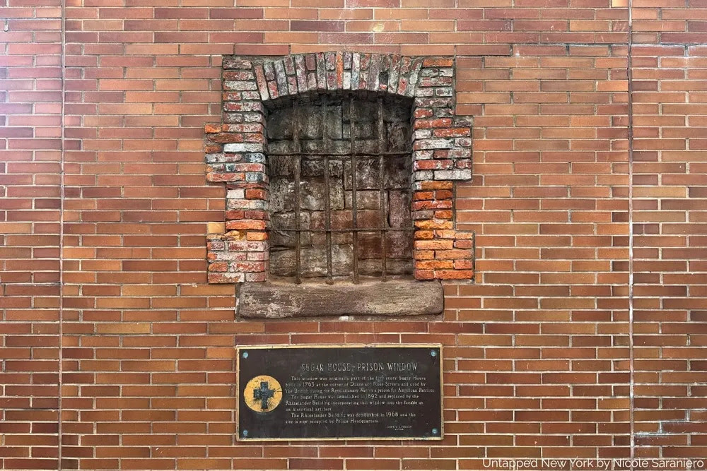
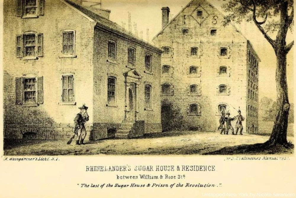
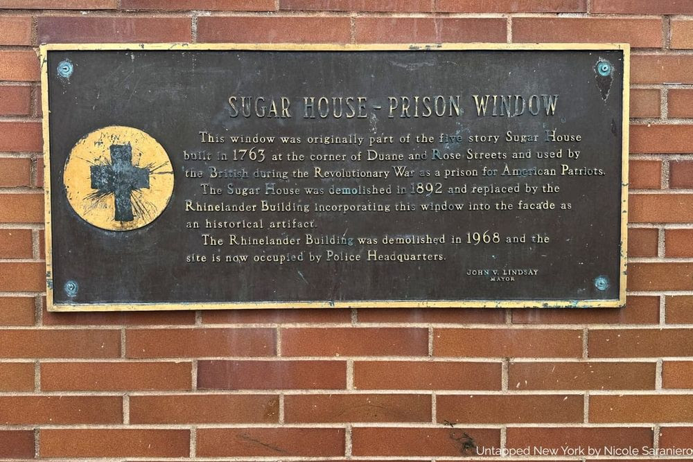
An overlooked monument to the victims of British imprisonment stands near one of NYC’s most iconic landmarks.Every day, New Yorkers pass a relic of the Revolutionary War without giving it a second glance. On Duane Street, embedded a wall near the NYPD Headquarters and Brooklyn Bridge–City Hall/Chambers Street subway station, steps away from the Manhattan Municipal Building, there is window from a sugar warehouse that dates back to 1763. The window is a vestige of the Rhinelander (originally Cuyler) Sugar House, which some believe was used as a prison during the British occupation of New York from 1776 to 1783.
There is some controversy over this widely accepted story though. In his book Forgotten Patriots, Brooklyn College professor Edwin G. Burrows found evidence that Cuyler, the owner of the refinery, “was a Tory, and his refinery appears to have continued to operate during the occupation.” If Burrows is correct, the plaque here joins the long list of incorrect historical plaques in New York City.
Manual of the Corporation of the City of New York, 1857, via Internet Archive
Regardless, the memorial stands testament to the brutality suffered by American revolutionary prisoners at the hands of the British during the war. The more infamous Livingston sugar house on Liberty Street housed up to 500 prisoners, according to this harrowing first-person account by Levi Howard, printed in The New York Times in 1852. More than twice the number of deaths occurred in sugar houses and on prison ships than on the battlefield during the American Revolution. The Prison Ship Martyrs Monument in Fort Greene Park is perhaps the most famous memorial to these victims.
Grant Thorburn, a Scottish immigrant, lamented upon the demolition of the Liberty Street Sugar House in 1840 that “it is probable that in the year two thousand and twenty-one there will not be found a man in New-York who can point out the site whereon stood a prison whose history is so feelingly connected with our revolutionary traditions.” [from Forgotten Patriots]
After the war, the Rhinelander Sugar House fell into disrepair and people believed it to be haunted. The Rhinelander Building replaced the sugar house in 1892, until it was demolished in 1968 to become what is now the NYPD headquarters site. The window was left intact both times for preservation, offering New Yorkers a remnant of the Revolutionary War.
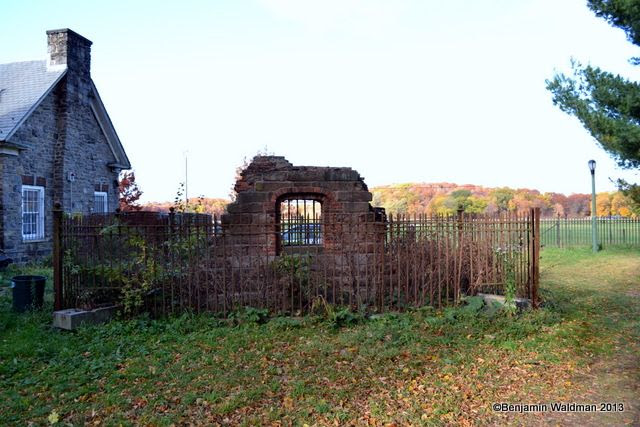
Interestingly, another window from the Rhinelander Sugar House was relocated to Van Cortlandt Park where it currently stands as a memorial. The Van Cortlandt sugar house, which was demolished in 1852, is also believed to have been used as a prison. Columns from the Rhinelander Building stand in a public area on Madison Street.
CREDITS
UNTAPPED NEW YORK
All image are copyrighted (c) Roosevelt Island Historical Society unless otherwise indicated THIS PUBLICATION FUNDED BY DISCRETIONARY FUNDS FROM CITY COUNCIL MEMBER JULIE MENIN & ROOSEVELT ISLAND OPERATING CORPORATION PUBLIC PURPOSE FUNDS.
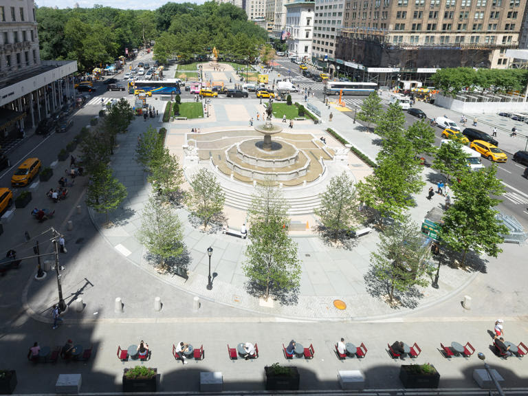
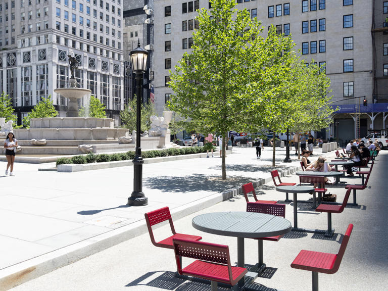
One of Manhattan’s busiest and most iconic corridors has been redesigned into a fabulous new pedestrian space. The Fifth Avenue Association, in partnership with the NYC Department of Transportation and landscape architecture firm Field Operations, has officially unveiled a vibrant 7,500-square-foot pedestrian plaza at Grand Army Plaza South. Located right near the entrance to Central Park and the historic Plaza Hotel, this completely revitalized space transforms what was once a congested traffic lane into a world-class public sanctuary.
Despite seeing millions of shoppers, tourists and commuters every year, this stretch of Fifth Avenue has historically lacked places for people to actually slow down. The new plaza completely changes the game, offering custom tables, chairs and benches that comfortably seat up to 64 people. Framed by lush, rotating seasonal planters that will bloom year-round, the formerly chaotic zone is now a scenic spot for a rest.
This public-private transformation serves as a stunning preview of the “Future of Fifth” initiative—the first large-scale redesign in the avenue’s 200-year history. This massive upcoming redevelopment plans to permanently transform the corridor from Bryant Park to Central Park by widening sidewalks, adding lush greenery and prioritizing a pedestrian-first experience. It follows the recent reveal of a major renovation of Grand Army Plaza South, including a restoration of the Pulitzer Fountain.
While the Angelina Paris pop-up is a summer treat, the beautiful public seating and vibrant planters are here to stay year-round. So next time you’re hustling down Fifth Avenue, set aside some time to take a break and marvel at the transformation.
Credits
TIME OUT NEW YORK
All image are copyrighted (c) Roosevelt Island Historical Society unless otherwise indicated THIS PUBLICATION FUNDED BY DISCRETIONARY FUNDS FROM CITY COUNCIL MEMBER JULIE MENIN & ROOSEVELT ISLAND OPERATING CORPORATION PUBLIC PURPOSE FUNDS.
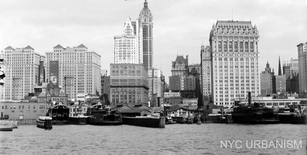
Singer Building (middle) with West Street Building (right) from the Hudson, 1908.
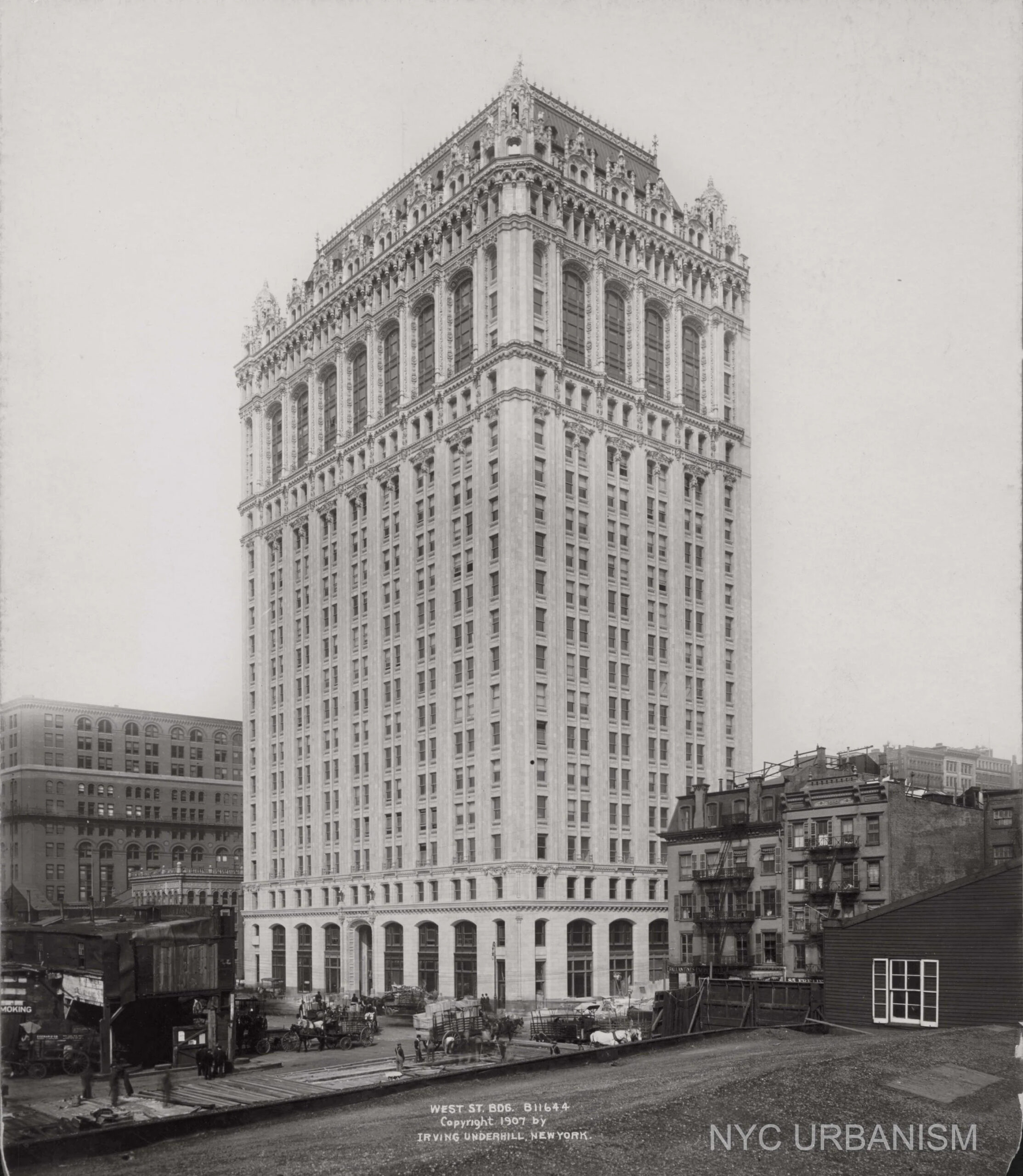
Our favorite NYC skyscraper, the Woolworth Building has two younger siblings, the Broadway Chambers Building (1900), and 90 West Street (1907). Both buildings were designed by Woolworth Building architect Cass Gilbert, but Woolworth’s gothic influence is truly seen in 90 West, which is clad head to toe in ornamental terra cotta.
The New York Times described the building when it was first proposed, “It is to be twenty-three stories high and finished on the uppermost stories in beautiful colored terra cotta, harmonizing with the copper sheathed mansard roof. Its unobstructed frontage on the river will make it one of the landmarks to those who use the North River ferries.”
Blocks away from the office buildings on Broadway, the West Street building was located on the banks of the Hudson directly across the street from the docks to serve the adjacent shipping and railway industries. Gilbert and structural engineer Gunvald Aus designed the building to be completely fireproof using state of the art methods including double layer terra cotta on the facade making it more than a foot thick. Steel columns and stairwells were encased in thick tiles and each floor was separated by foot-thick arched tiles to prevent the spread of fire with granite at the base as wide as six feet. After completing the West Street building in 1907 Gilbert would go on to design the Woolworth Building, the tallest skyscraper the world when it opened in 1913.
⠀⠀⠀⠀⠀ In the 1970s the building was saved from demolition, with the World Trade Center urban renewal border stopping across the street from the terra-cotta tower. In the shadow of the 110-story Twin Towers, the West Street Building was no longer on the banks of the Hudson; the newly created Battery Park City would add 92 acres of landfill to the west of the ornamental skyscraper.
On 9/11 the building suffered severe damaged and burned for three days. Yet, the building’s fireproofing saved it from complete devastation leaving much of the structure intact. Following 9/11 the skyscraper was restored, with the Boston Terra Cotta Company fabricating 7,853 new pieces of terra-cotta and over 100 replacement gargoyles and grotesques including seven contemporary faces – the building’s owners, contractors, and project manager. 75 percent of the north facade’s granite would be replaced during the restoration. During this time the building was converted from offices to house 410 rental apartments.
Credits
National Constitution Center National Archives *Both websites have extensive information on this letter
All image are copyrighted (c) Roosevelt Island Historical Society unless otherwise indicated THIS PUBLICATION FUNDED BY DISCRETIONARY FUNDS FROM CITY COUNCIL MEMBER JULIE MENIN & ROOSEVELT ISLAND OPERATING CORPORATION PUBLIC PURPOSE FUNDS.
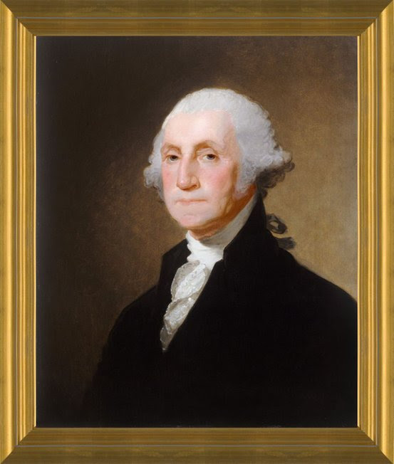
On August 21, 1790, President George Washington composed a letter to the Hebrew Congregation of Newport, Rhode Island, and to its leader, Moses Seixas. Seixas had written a letter to Washington four days earlier. In this letter, Seixas described the benefits that his community received under the new Constitution and expressed his “deep sense of gratitude to the Almighty” for “a Government . . . erected by the Majesty of the People,” committed to the “liberty of conscience,” and “deeming every one, of whatever Nation, tongue, or language equal parts of the great governmental Machine.” Washington responded with a brief but powerful letter, expressing America’s enduring commitment to the principle of tolerance and the freedom of conscience.
Gentlemen.
While I receive, with much satisfaction, your Address replete with expressions of affection and esteem; I rejoice in the opportunity of assuring you, that I shall always retain a grateful remembrance of the cordial welcome I experienced in my visit to Newport, from all classes of Citizens.
The reflection on the days of difficulty and danger which are past is rendered the more sweet, from a consciousness that they are succeeded by days of uncommon prosperity and security. If we have wisdom to make the best use of the advantages with which we are now favored, we cannot fail, under the just administration of a good Government, to become a great and a happy people.
The Citizens of the United States of America have a right to applaud themselves for having given to mankind examples of an enlarged and liberal policy: a policy worthy of imitation. All possess alike liberty of conscience and immunities of citizenship. It is now no more that toleration is spoken of, as if it was by the indulgence of one class of people, that another enjoyed the exercise of their inherent natural rights. For happily the Government of the United States, which gives to bigotry no sanction, to persecution no assistance, requires only that they who live under its protection should demean themselves as good citizens, in giving it on all occasions their effectual support.
It would be inconsistent with the frankness of my character not to avow that I am pleased with your favorable opinion of my Administration, and fervent wishes for my felicity. May the Children of the Stock of Abraham, who dwell in this land, continue to merit and enjoy the good will of the other Inhabitants; while every one shall sit in safety under his own vine and figtree, and there shall be none to make him afraid. May the father of all mercies scatter light and not darkness in our paths, and make us all in our several vocations useful here, and in his own due time and way everlastingly happy.
Go: Washington
CREDITS National Constitution Center National Archives *Both websites have extensive information on this letter
All image are copyrighted (c) Roosevelt Island Historical Society unless otherwise indicated THIS PUBLICATION FUNDED BY DISCRETIONARY FUNDS FROM CITY COUNCIL MEMBER JULIE MENIN & ROOSEVELT ISLAND OPERATING CORPORATION PUBLIC PURPOSE FUNDS.
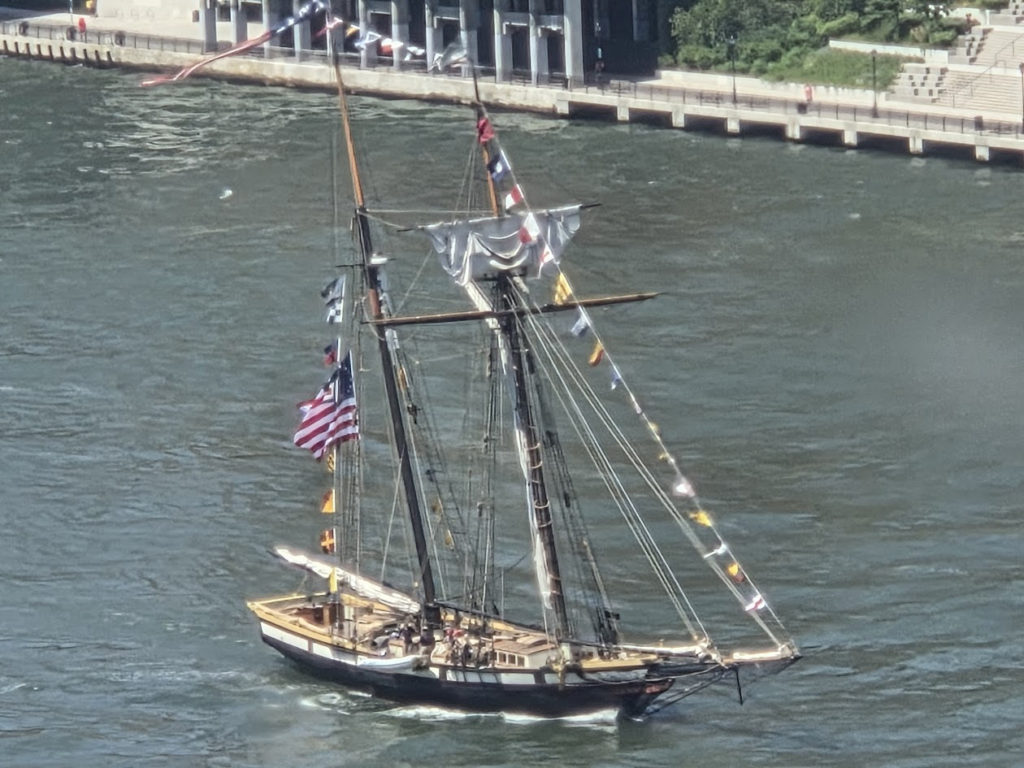
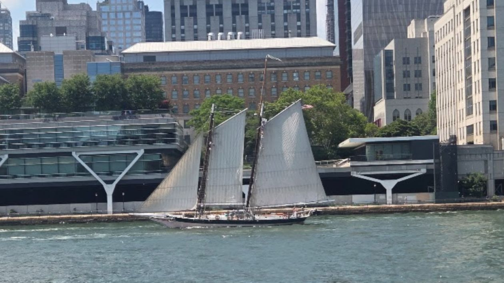
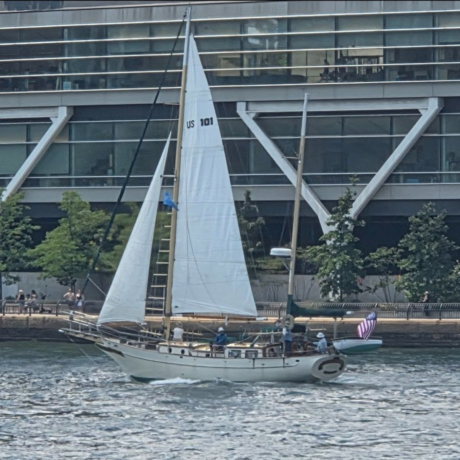
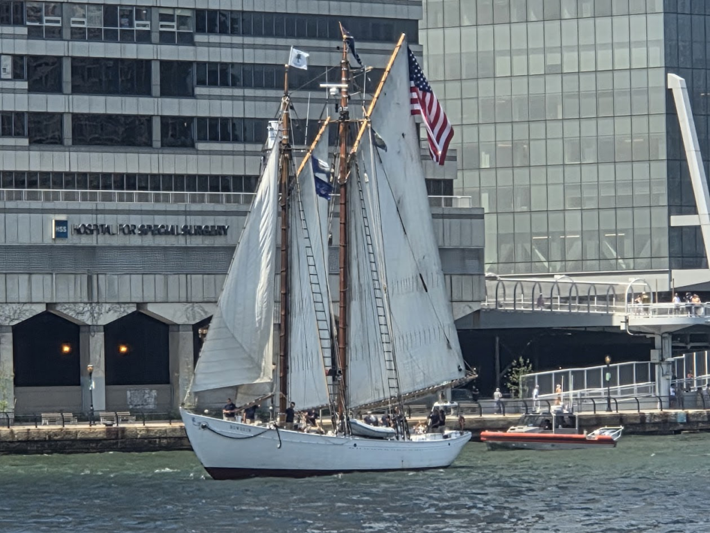
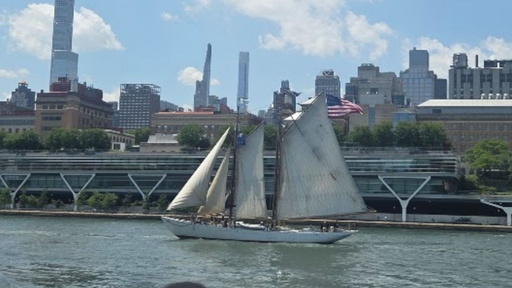
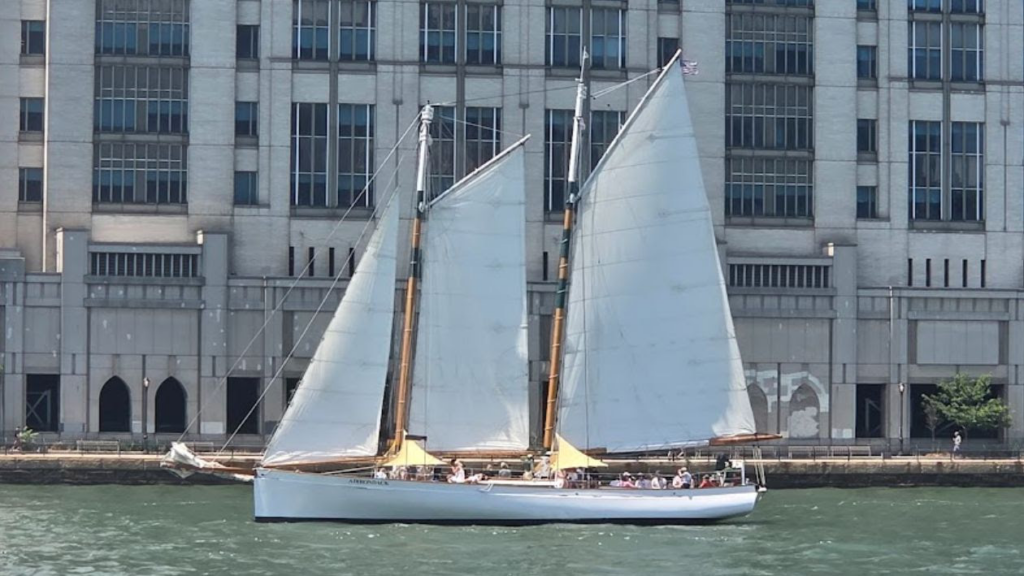
For 90 Minutes on Friday an ARRAY OF SAILING SHIPS PASSED BY THE ISLAND GIVING US A GRAND VIEW
CREDITS
Judith Berdy
All image are copyrighted (c) Roosevelt Island Historical Society unless otherwise indicated THIS PUBLICATION FUNDED BY DISCRETIONARY FUNDS FROM CITY COUNCIL MEMBER JULIE MENIN & ROOSEVELT ISLAND OPERATING CORPORATION PUBLIC PURPOSE FUNDS.
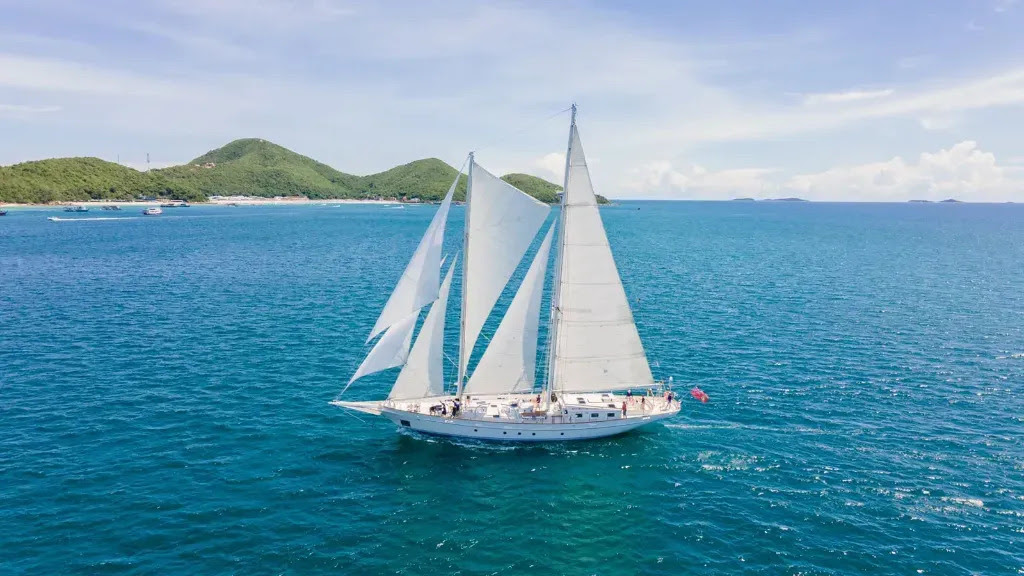
S/Y Vela is the sister ship to S/Y Argo. She is a two-masted staysail schooner that measures 112-ft overall and accommodates twenty six students and seven professional crew on ocean voyages around the globe. She is certified and inspected by the British Maritime and Coastguard Agency as a Category “0” vessel, allowing her unrestricted operation in the world’s oceans. Sailing under the Sea, mester flag, Vela will circumnavigates the globe offering students the chance to cross oceans while furthering their educational and personal goals in a highly experiential college-level academic setting.
Program Type: Sail Training, Marine Science, Accredited Semesters, Deep Sea Voyages, Study Abroad, Gap Year, Adventure Travel, Other: Experiential education semesters for high school graduates and college students; accredited academics with sail and scuba training, service projects and adventure travel
A fleet of U.S. and international Class B tall ships will participate in the America 250 Parade of Sail, showcasing a diverse array of training and historic vessels along the East River and other U.S. ports.
Overview of Class B Ships
The Class B tall ships are smaller than the Class A vessels but are equally impressive, often used for sail training, education, and cultural exchange. During the America 250 celebrations, these ships will sail down the East River from the head of the river to Gravesend Bay, Brooklyn, providing spectators with a rare opportunity to see them in motion america250.org. The event is part of the larger Sail4th 250 program, which is the New York segment of the nationwide Sail250 celebrations sail4th.org+1.
Participating Ships and Origins
While a complete list of all Class B ships has not been fully published, the fleet includes a mix of U.S. and international vessels, complementing the larger Class A ships such as the USCG Barque Eagle and other foreign naval training ships sail4th.org+1. These Class B ships typically include schooners, brigs, and smaller full-rigged ships operated by universities, maritime academies, and sail training organizations. Examples of vessels in the broader Sail250 program include:
STV Vela – a 112-foot gaff-rigged schooner operated by Sea|mester, homeported in the British Virgin Islands, carrying a crew of about 30 including students sail4th.org.
Other Class B ships are expected to represent U.S. maritime academies and international sail training programs, providing hands-on training for cadets and students.
Event Highlights
Parade of Sail: Class B ships will lead a parade along the East River on July 3, 2026, preceding the larger Class A vessels on July 4 sail4th.org.
Public Engagement: Many ships will offer educational programs, tours, and demonstrations for visitors, highlighting maritime history and seamanship america250.org+1.
Global Participation: The fleet includes ships from multiple nations, emphasizing international goodwill and cultural exchange alongside the U.S. vessels sail4th.org+1.
Summary
The Class B ships at America 250 represent a diverse and educational fleet, smaller than the Class A tall ships but integral to the Parade of Sail and maritime celebrations. They provide a unique opportunity for the public to witness traditional sailing vessels in action, while also supporting cadet training and international maritime cooperation. For the most up-to-date list of participating Class B ships, visitors can check the official Sail4th 250 website or the America250 event page
america250.org+1.
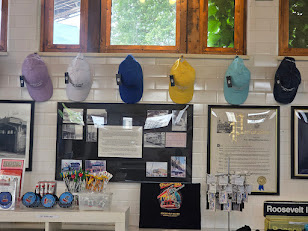
Time for a New Baseball Cap?
Multiple Colors Check them out at the Kiosk
CREDITS
Sail USA 250 Judith Berdy
All image are copyrighted (c) Roosevelt Island Historical Society unless otherwise indicated THIS PUBLICATION FUNDED BY DISCRETIONARY FUNDS FROM CITY COUNCIL MEMBER JULIE MENIN & ROOSEVELT ISLAND OPERATING CORPORATION PUBLIC PURPOSE FUNDS.
The 1876 Centennial was an all-out party in Gotham—fireworks, military parades, musical performances, and thousands of American flags and bunting draped over the windows of city buildings, houses, and hotels.
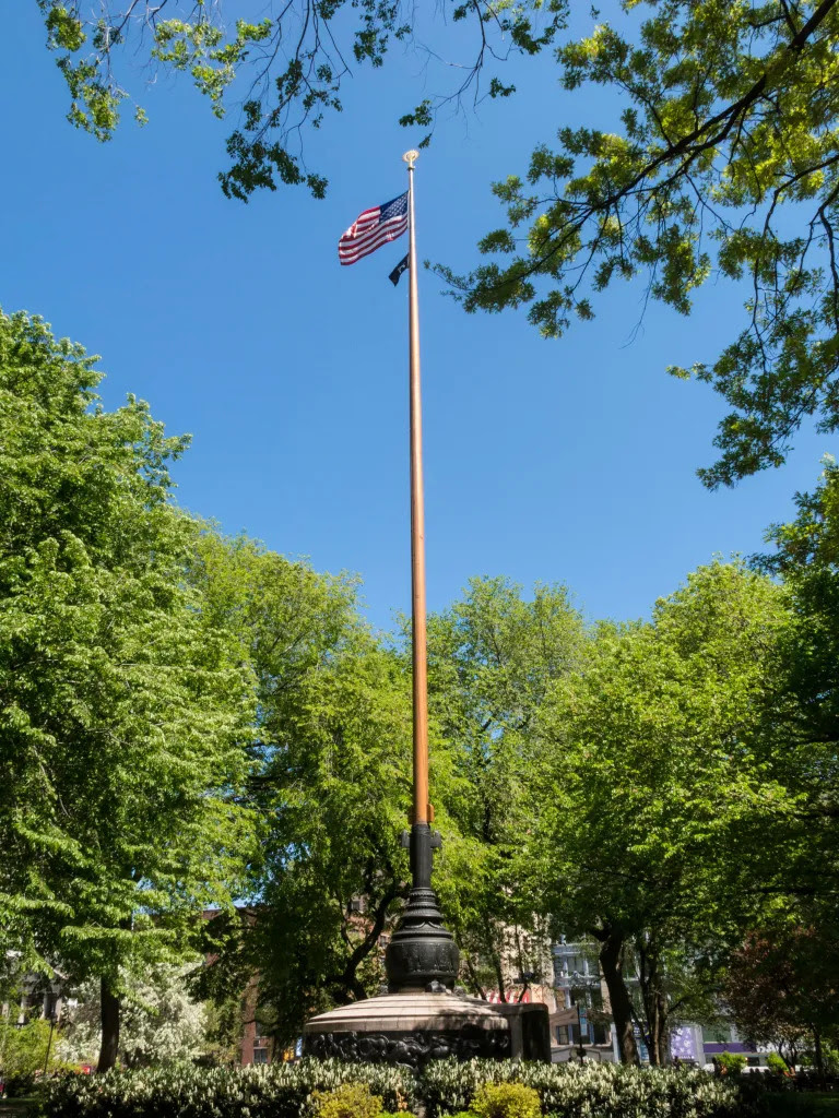
But the Sesquicentennial, or America’s 150th birthday? By comparison, it was much more low-key.The big national celebration took place at Philadelphia’s Sesquicentennial International Exposition. In New York City, smaller events focused on patriotic education and the creation of historical markers.Yet the 1926 celebration did bring a new addition to Union Square: the Independence Flagstaff, one of the tallest flagpoles in New York state, according to NYCParks. You’ll find this towering monument in the center of the park
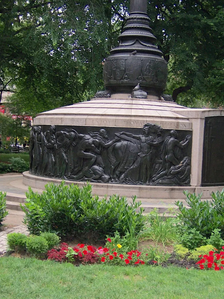
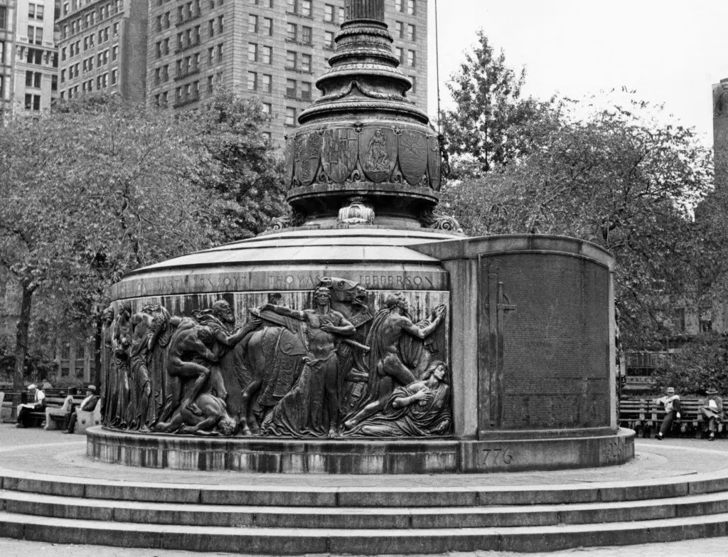
“The intricate bas-reliefs and plaques were completed in 1926 by sculptor Anthony De Francisci, and feature a procession of allegorical figures representing democracy and tyranny, the text of the Declaration of Independence, and emblems from the original 13 colonies,” states NYC Parks.
The problem was that the flagstaff was gifted to the city by the Tammany Society. This infamous political machine long associated with corruption and scandal had their headquarters near the park on East 14th Street.
The flagstaff was supposed to be dedicated to Charles Murphy, a recently deceased Tammany president. But controversy arose, as the dedication was considered an insult to America’s founding fathers.
“Public sentiment prevented honoring a symbol of Tammany corruption in a manner commensurate with Lincoln and Washington at Union Square Park, and by the time the Murphy Flagpole was dedicated on July 4, 1930, to commemorate the 150th anniversary of the Declaration of Independence, it was referred to as the Independence Flagstaff.”
That quote in the second photo chiseled into the base comes from Thomas Jefferson: “How little do my countrymen know what precious blessings they are in possession of and which no other people on earth enjoy.”
Time for a New Baseball Cap?
Multiple Colors Check them out at the Kiosk
CREDITS
EPHEMERAL NEW YORK
[Top image: Alamy; second image: NYCParks; third image: Angelo Rizzuto (1940s)]
All image are copyrighted (c) Roosevelt Island Historical Society unless otherwise indicated THIS PUBLICATION FUNDED BY DISCRETIONARY FUNDS FROM CITY COUNCIL MEMBER JULIE MENIN & ROOSEVELT ISLAND OPERATING CORPORATION PUBLIC PURPOSE FUNDS.